Design comparison
SolutionDesign
Solution retrospective
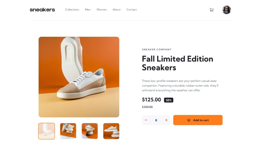
Good day everyone! This is my solution for E-commerce product page. I will appreciate for any comments.
Community feedback
- @Wr3nDPosted about 2 years ago
It feels like you are missing lot of font sizes,spaces ,navbar color, underline under navbar, max-w limitation to specific size + margin auto, wrong icon of basket , not enought attention to detail and this project is all about that ... also if you want to improve more you should propably write it inside of some framework like react forexample and put parts into components, that would be best practice ! good luck on your journey i have been there too !
0
Please log in to post a comment
Log in with GitHubJoin our Discord community
Join thousands of Frontend Mentor community members taking the challenges, sharing resources, helping each other, and chatting about all things front-end!
Join our Discord
