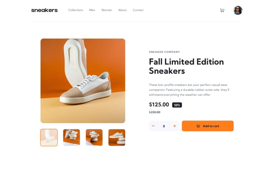
Design comparison
Solution retrospective
Okay, i admit... this was quite challenging using react and it was entirely worth it... double click the thumbnails to activate the lighthouse view, had to change clicks due to the single click toggling switching images.
Community feedback
- @besttlookkPosted over 2 years ago
I Found folloing issues with your solution:
1.For smaller screen, Sidemenu is open by default. 2. For smaller screen, Sidemenu should close when clicking outside. 3.For smaller screen, Something happens with image when i open and close side menu. 4. You did not make slider for small screen. There is no prev or next button. 5. When add items to card. No of quantity should be visible over cart icon. 6. when i decrese the quantity to 0 and then again try to decrease it get backs to 1. Why so? 7. You didnot add hover effect on nav-item. 8. You did not add lightbox feature. 9. For ultra wide screen whole page is huge. 10. Overall it does not look stable.
Here is my attempt to this: https://e-commerce-product-page-fem.herokuapp.com/
I am no expert but i am happy to help if you need any. Good luck.
1@HaybukaPosted over 2 years ago@besttlookk
- Must be some state I forgot to untoggle, thanks for that.
- I dnt think for an e-commerce you are supposed to decrease past 0, so my logic takes you to 1 when you try end up negative.
- I think you have my result confused with someone else, you should check again if you have the time.
- Yes, you are correct about that, and it was on purpose.
- Will work on that and apply necessary actions.
- Lightbox feature is present, you didn't read my comment.
- Ultra wide screen, it has to be huge dnt you think?. "It is ultra wide".
Thank you, really appreciate you taking the time, will work on the updates v2.0 😂
0 - @mrvicthorPosted over 2 years ago
well done. just a few observations;
- the active class on the navbar is not visible
- when you click an item, I think a modal pop-up of the selected item is supposed to be shown.
- finally the mobile version needs a little touch.
1@HaybukaPosted over 2 years ago@mrvicthor 2. I placed in the submission comment... Double-click on the thumbnails to see the modal.. for the mobile you just said, would help if you are specific about the touch up... Thanks for the observation
0@mrvicthorPosted over 2 years ago@Haybuka ok, sorry i may have missed that. on the mobile, i meant the image and the padding as well
0@HaybukaPosted over 2 years ago@mrvicthor i checked the mobile on the design, the padding tallies, and the image snaps to the view ... unless if you viewed on a tablet is where you'd see some padding beside the image (view port and all).
0
Please log in to post a comment
Log in with GitHubJoin our Discord community
Join thousands of Frontend Mentor community members taking the challenges, sharing resources, helping each other, and chatting about all things front-end!
Join our Discord
