Submitted about 1 year ago
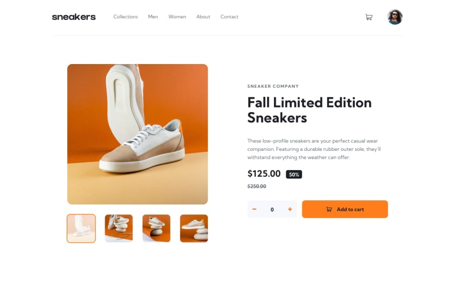
E-commerce product page
@ana-cassia-invernizzi
Design comparison
SolutionDesign
Community feedback
- @ImhandegbeloPosted about 1 year ago
This is a beautiful solution to the challenge. However, these fixes would make it great.
- Ability to close the lightbox when outside it is clicked
- on my screen, i noticed the navbar overlaps the image (i think you should rather reference your main component to the top instead of bottom
- To improve your image load times, use the main image in place of the thumb and style to fit
Great work!
Marked as helpful2
Please log in to post a comment
Log in with GitHubJoin our Discord community
Join thousands of Frontend Mentor community members taking the challenges, sharing resources, helping each other, and chatting about all things front-end!
Join our Discord
