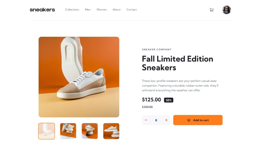
Design comparison
SolutionDesign
Solution retrospective
please, if you think you could have done it better, feel free to say, I did it with some difficulty with javascript, and css to position some things, but mainly javascript, so feel free for tips and ideas
Community feedback
- @PaoloVilardiPosted over 1 year ago
Hi Gabriel, it seems like you need a couple of adjustments to make it perfect! Here's a few:
- the cart when is empty has the checkout button while it shouldn't appear
- when you add items to the cart, the cart icon which should indicates the preview of the item quantities inside of it doesn't contain any value (it's just a round orange icon)
- the total price of the item in the cart is static in your case (always 375) while you should calculate it by multiplying the actual price of the item for the quantity
- the delete button of the item in the cart doesn't do anything, it should delete the items from the cart (both logically, so delete it from the array or list where you store the cart in JavaScript, and visually, so it shouldn't appear in the cart section. Remember in this case to check if the cart is empty, if it is so, your cart should appear empty (in this case, with the "Your cart is empty" section)
- you didn't implement the lightbox, which should be a whole new section on top of the product page while the background is sort of obscured Let me know if you need some deepening about any of these. Happy coding!
Marked as helpful0@Gabreel-AraujoPosted over 1 year agohi @PaoloVilardi, thanks for the tips, really I hadn't seen these details, thank you very much, I'll try to improve it
1
Please log in to post a comment
Log in with GitHubJoin our Discord community
Join thousands of Frontend Mentor community members taking the challenges, sharing resources, helping each other, and chatting about all things front-end!
Join our Discord
