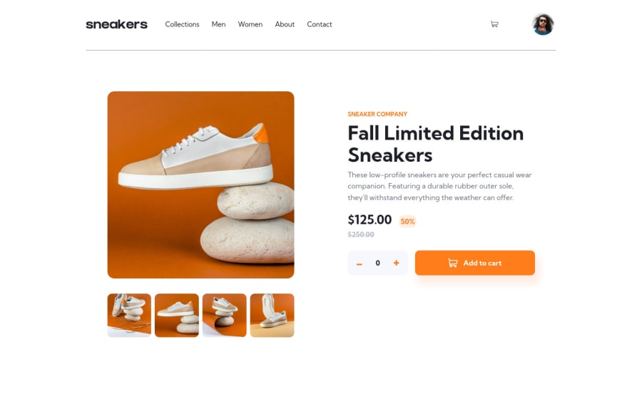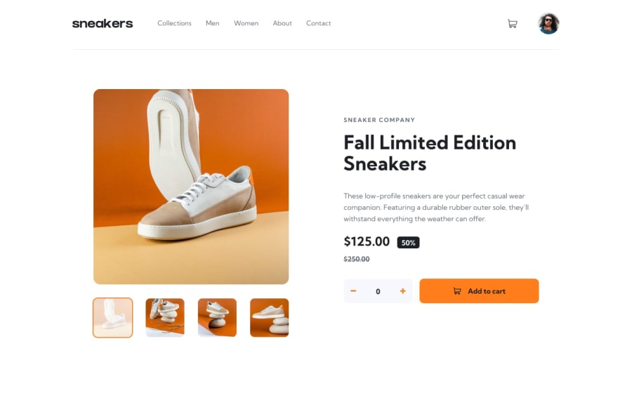
Design comparison
SolutionDesign
Solution retrospective
Frontend mentor challenges are built in such a way that , there is always something to learn from the challenge , even if the challenge is rated lower in the ranks.
- One of the challenges that came up during the implementation was how to use a carousel. The challenge has 4 main images that resembles a carousel, the mobile version was not that difficult to create . I had opted to hide the items that where not in view using
position: absolute, the problem started to appear when the screen size grew bigger and the image had to be on the left and the sibling content on the right. The issue happened when you resize using dev tools , such that for someone using any device that would have gone unnoticed. The option that i finally settled for was to change the src attribute.
Community feedback
Please log in to post a comment
Log in with GitHubJoin our Discord community
Join thousands of Frontend Mentor community members taking the challenges, sharing resources, helping each other, and chatting about all things front-end!
Join our Discord
