Design comparison
Solution retrospective
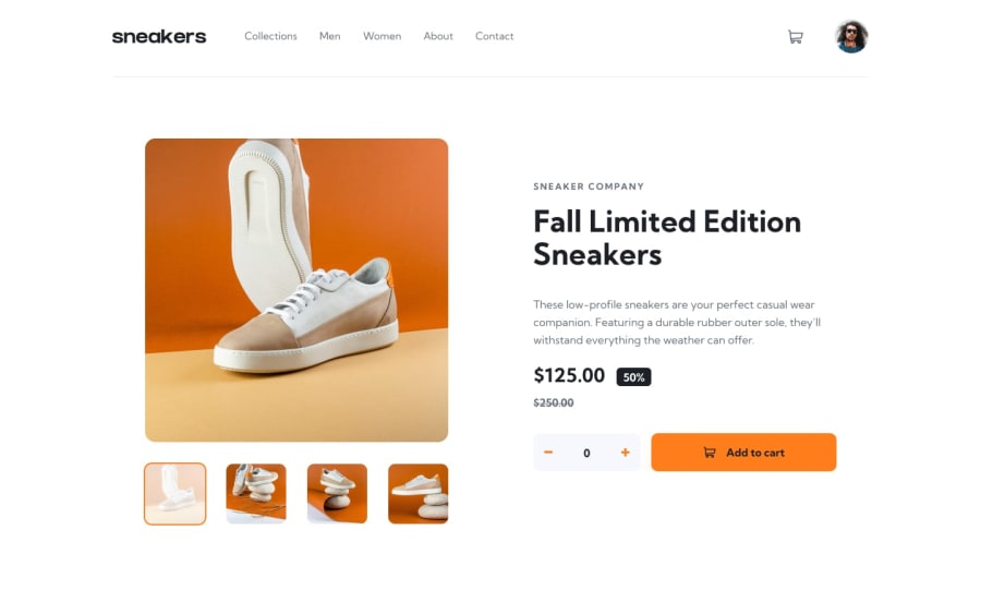
I used tailwind to build the entire page, it took time to complete the page. It was an absolute nightmare, to make the page responsive, but it works! If you have any suggestion, feel free to tell me. Thanks!
Community feedback
- @CelsoTavaresPosted almost 2 years ago
Congratulations on the work Jorge, I have a tip that I believe is very useful, use max-widht in your projects, to limit the design on larger screens, have a great day...let's evolve.
1 - @yishak621Posted almost 2 years ago
Good design amd also consider adding a black background overlay when the sidebar opens ....and in the mobile version when we arrive to last picture we should pass to the first picture and vice versa
1@Jtorres1000Posted almost 2 years ago@yishak621 A friend told me the same thing, I added both, thanks!
0
Please log in to post a comment
Log in with GitHubJoin our Discord community
Join thousands of Frontend Mentor community members taking the challenges, sharing resources, helping each other, and chatting about all things front-end!
Join our Discord
