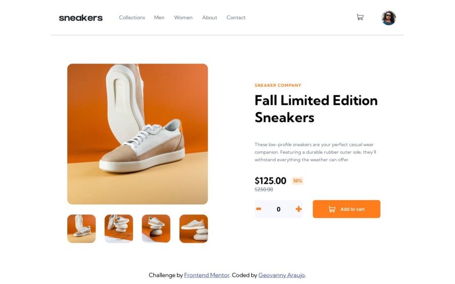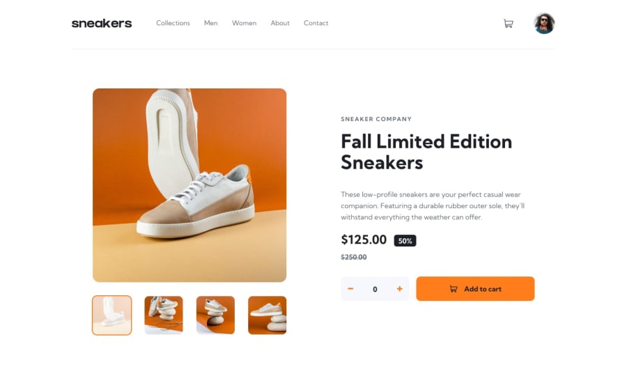
Design comparison
SolutionDesign
Solution retrospective
Any comment will be greatly appreciated
Community feedback
- @kartardeveloperPosted about 2 years ago
Hey Geovanny, Everything looks great except for some spaces and sizes. The space between the product title and description is too large you can decrease it and the quantity selector is too big. Quantity selector icons are too big. You can improve it more. I hope this will help you. If you need any help I'm always there. Best of luck with your next challenge. 👍
1
Please log in to post a comment
Log in with GitHubJoin our Discord community
Join thousands of Frontend Mentor community members taking the challenges, sharing resources, helping each other, and chatting about all things front-end!
Join our Discord
