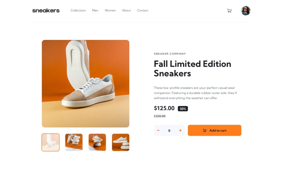
Design comparison
Solution retrospective
My first set of JavaScript codes. Comments on areas of improvement and best practices will be appreciated 🙏
Community feedback
- @LuizaUszackiPosted over 2 years ago
Hi @Deen-Abdultawab, congratulations on the website. I would also advise you to...
-
Put the type of the input
product-quantityas number instead of text (in that case, you would have to hide the arrows that will come with that type to have the same appearence), because now, even if I can't submit a text, I still can write there; -
You could also test if the
product-quantityhas a value greater than zero, and just if so, decrease its value. Otherwise, your input can receive negative values;
minusBtn.addEventListener('click', () => { if (productQuantity.value > 0) { initialValue--; productQuantity.value = initialValue; } })-
I also saw you put
cursor: pointeron fa-solid, in that case, you could increase its padding to turn the clickable area bigger, making it easier for the user to click on it; -
And at least, all your
main-navhascursor: pointernot just the clickable areas.
I hope it helps you.
Marked as helpful1@Deen-AbdultawabPosted over 2 years ago@LuizaUszacki Thanks a lot. Very helpful
0 -
Please log in to post a comment
Log in with GitHubJoin our Discord community
Join thousands of Frontend Mentor community members taking the challenges, sharing resources, helping each other, and chatting about all things front-end!
Join our Discord
