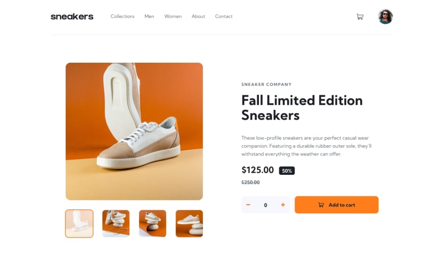
Design comparison
Solution retrospective
Any suggestions and feedbacks are very welcome!
Community feedback
- @sulemaan7070Posted almost 2 years ago
hey Shalini Anand 😄, good job on completing the challenge!! here are a few improvements you can make to your site!!
** regarding the CSS🎨** 1.You can go the
style-guide.mdand copy HSL value of orange color and apply to necessary elements.2.Add a box-shadow to the button and give it a orange-shadow.
box-shadow: 0 0.3125rem 0.625rem -0.125rem hsl(26deg 100% 55%);3.You can flip the + and - buttons order.
regarding the functionality🪛
1.when ever we do plus or minus to the items they are automatically getting added to the cart.. they should only be added when button is clicked.
2.The user should be able to delete the items from the cart whenever the delete SVG is clicked.. The sneakers images section is remarkable good job💯💯 happy coding🔥🔥
Marked as helpful1
Please log in to post a comment
Log in with GitHubJoin our Discord community
Join thousands of Frontend Mentor community members taking the challenges, sharing resources, helping each other, and chatting about all things front-end!
Join our Discord
