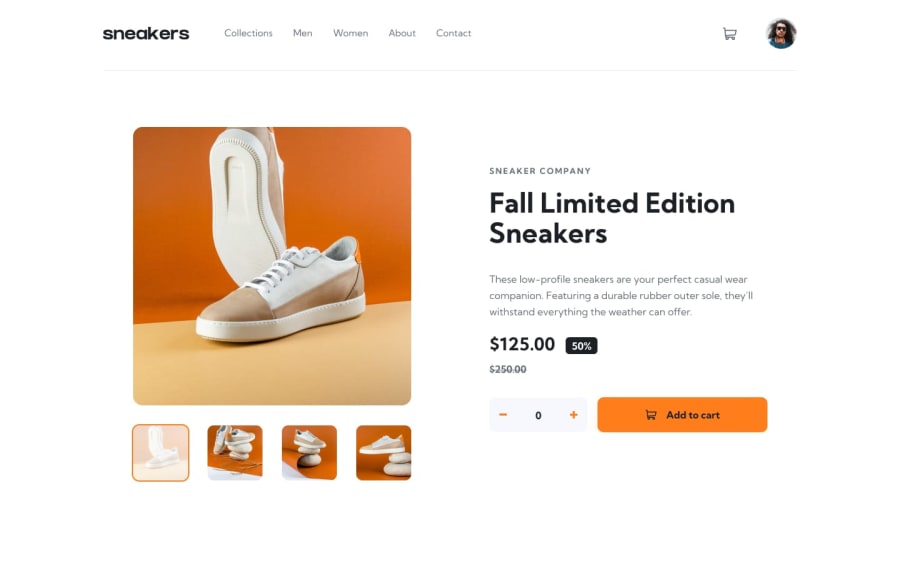
Design comparison
Solution retrospective
Well, this challenge literally forced me to think a bit deeply in order to manage the contents of it, according to me the easier it seems its not that easy when coding for it. I know i could have write short js codes but for the first attempt i was more concern about the functionality rather writing shorter code. But will do it again soon, with improved coding usability. The best part is that in some places you need to think of your own that how this ecommerce site should work as a consumer.(atleast its what i did). I hope this my solution will be helpful for other beginners like me, if i can you can as well. Thanks frontendmentor. Any suggestions is appreciated. Happy Coding
Community feedback
- @dev-mksinghPosted about 2 years ago
Well, i'm really happy with myself because this challenge made me think a bit deep, maybe because i was trying to figure out how this ecommerce site should be available to users. And from that perspective i tried to do much possible expectations from this kind of sites. I know my codes must be lengthy right now in this challenge, but my main focus was to provide functionality at first. In future i will update the code with much short code. Right now in this challenge i'm less focused on the layout and more focused in interactivity of user. Thanks frontendmentor. Any suggestion is appreciated. Happy Coding.
0
Please log in to post a comment
Log in with GitHubJoin our Discord community
Join thousands of Frontend Mentor community members taking the challenges, sharing resources, helping each other, and chatting about all things front-end!
Join our Discord
