


@sulemaan7070
Posted
hey Swagata Roy😄, congratulations on completing the challenge... You did a great job on the desktop version💯💯..here are a few tips to make your site better.
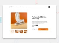
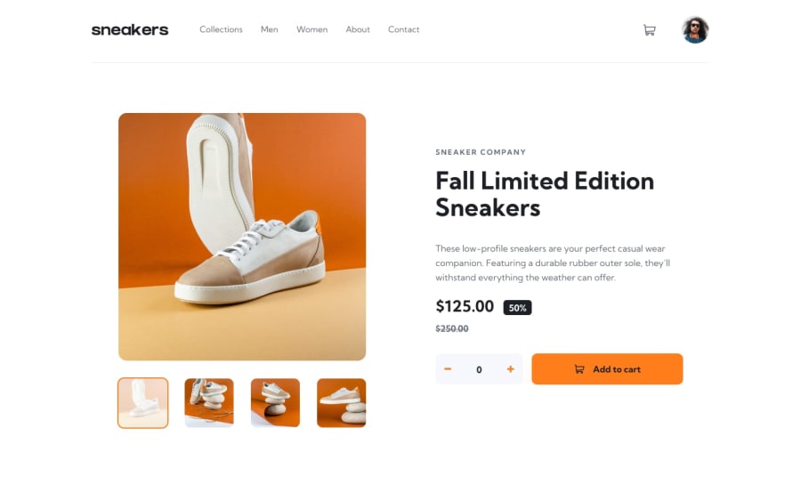
1.The images of sneakers seem to be squeezed🚫 on the mobile-version, using the property object-fit :contain✅ will prevent the images from being squeezed or stretched..
2.When Iam scrolling the website (on the mobile) I can't see whether the items to the cart are added or not.. you can make the header or nav position:sticky and top:0; that should do it.
3.Add overlay on the background when you are showing the mobile-menu.
Hope that helps,happy coding🔥🔥
Marked as helpful
@swagataroy30
Posted
@sulemaan7070 Hey thanks for the feedback - the object-fit: contain doesnot seem to work here as it is getting resized to maintain the aspect ratio while i want it to be strected taking up the full width and thanks for the 2nd suggestion is helpful will look at it 😄 and I did implement the bacdrop overlay for the mobile menu but donno why it ain't showing up ... thanks for pointing it out ! 😄👍
