Design comparison
Community feedback
- @TomSifPosted 5 months ago
Nice job ! :)
-
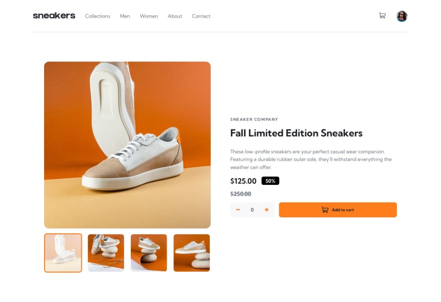
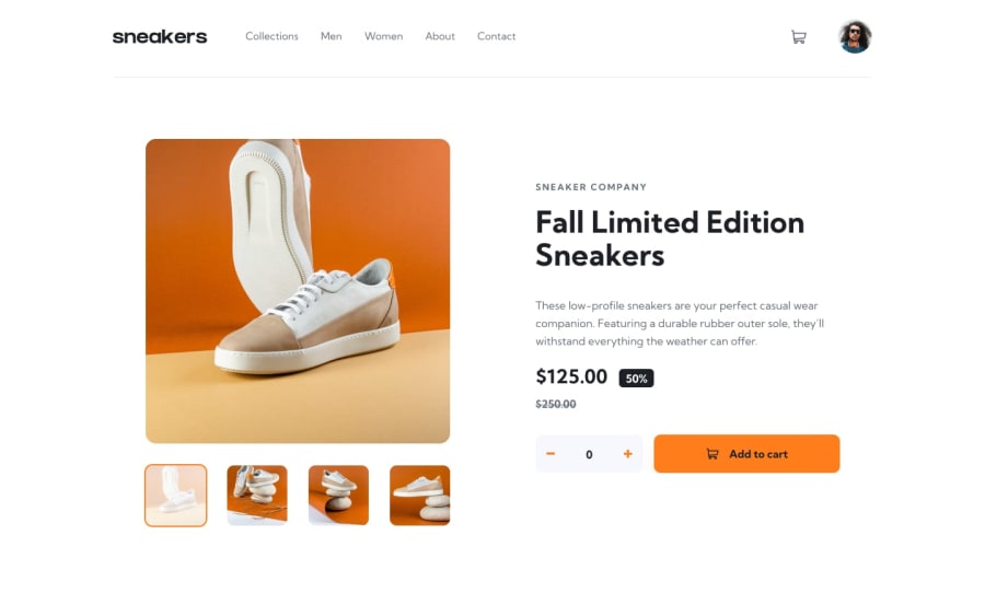
It's super well integrated, there's just a small bug when you click on the thumbnails in desktop version, the screen goes down and you can't access the navigation menu anymore, it can be quickly corrected however by removing overflow:hidden on the body or by adapting the size of the elements.
-
I really liked the + - buttons I would have liked to think of this design idea, however you could have animated the click on the buttons, it would have added user experience.
-
Otherwise it's better to use font-face for fonts and not forget the meta keyword and meta description tags for SEO referencing.
Keep up the good work it's really clean, cheers :)
0 -
Please log in to post a comment
Log in with GitHubJoin our Discord community
Join thousands of Frontend Mentor community members taking the challenges, sharing resources, helping each other, and chatting about all things front-end!
Join our Discord
