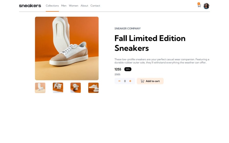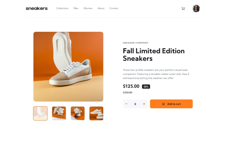
Design comparison
SolutionDesign
Solution retrospective
What specific areas of your project would you like help with?
I’d appreciate any feedback
Community feedback
- @DadciPosted 5 months ago
Hey you did great on this one! But you could improve your UI :
- give the same height to the left and right section.
- adjust the of your navbar the main section is too close.
- Align center the cart and profil image.
- adjust the spacing between the small product images it should be the same vertically and horizontally.
- in the right section the description should have the same width as the product title and the add to cart button should have more padding-x inside.
Hope it will be helpful to make your design neater! Good luck
Marked as helpful1@NadaElhoPosted 5 months ago@Dadci Thank you for your feedback 🙏, I will work on it
0
Please log in to post a comment
Log in with GitHubJoin our Discord community
Join thousands of Frontend Mentor community members taking the challenges, sharing resources, helping each other, and chatting about all things front-end!
Join our Discord
