
Submitted over 1 year ago
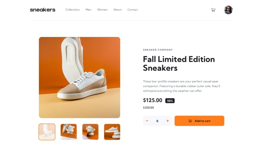
E-Commerce Page with Mobile Infinite Slider (Svelte, TS, Tailwind)

@fredcamp

Design comparison
SolutionDesign
Solution retrospective
To display the specific hero component on different viewports (small and large screen devices), we can create both separate components and render them depending on what viewport it falls. Since the Navigation and Hero Components both have different display. I created a viewport store wherein it tracks on what viewport size it belongs to.
Viewport Store
import { writable } from 'svelte/store'

let isDesktop = createStore(null)

function createStore(initial: boolean) {
  const { subscribe, set } = writable(initial)

  return {
    subscribe,
    set: (value: boolean) => {
      set(value)
    },
  }
}
export default isDesktop
To use it on the Hero Component, I created two components for the small and large viewports, and render them base on what the value of the store.
Hero Component
 import HeroSmall from './HeroSmall.svelte'
 import HeroLarge from './HeroLarge.svelte'
 import isDesktop from '../stores/viewport'
{#if $isDesktop}
<HeroLarge />
{:else}
<HeroSmall />
{/if}
Main Component
let innerWidth = window.innerWidth

$: if (innerWidth > 1024) {
    $isDesktop = true
} else {
    $isDesktop = false
}
<svelte:window bind:innerWidth />
Community feedback
Please log in to post a comment
Log in with GitHub
Join our Discord community
Join thousands of Frontend Mentor community members taking the challenges, sharing resources, helping each other, and chatting about all things front-end!
Join our Discord