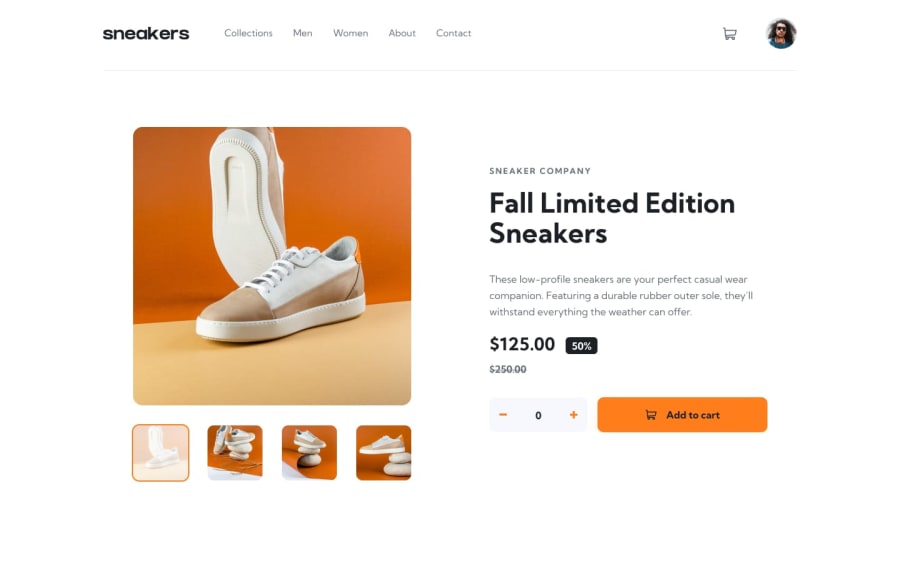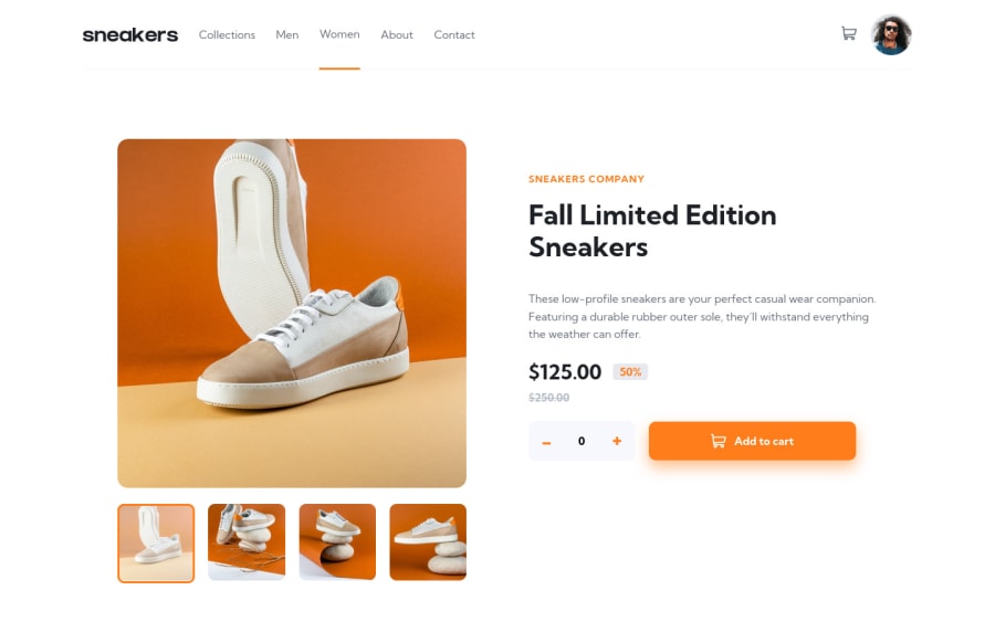
Design comparison
Solution retrospective
This is my E-Commerce challenge and I hope to discover it also any feedback will be appreciated
Community feedback
- @nikoescobalPosted over 2 years ago
Hello Omar! 👋
Congratulations on finishing your challenge! 🎉 Amazing job! Looks really close to the original!
Here's some feedback/suggestions on this solution:
- I recommend learning Sass as it helps keep code clean and easy to understand since there's the added ability to be able to nest classes. This enables you to mimic the structure of the HTML in your CSS.
- When clicking the add button, it seems the cart on the top right gets updated, but not the text with the price itself. You should make this dynamic rather than static.
- I'd recommend practicing building layouts without relying on absolute positioning unless necessary -- you can achieve much of the same results with just padding and margins. This would be especially helpful when it comes to adjusting the responsiveness of your website across any screen size
- Check the report to fix accessibility/HTML issues - you currently have 11 accessibility issues and 3 HTML issues listed
I hope this is helpful and all the best with your coding journey!
Marked as helpful0@0GeNN0Posted over 2 years ago@nikoescobal Thank you for your feedback 5 of the accessibility issues say that <li> must be in <ol> or <ul> I use the semantic element <menu> but it appears that the site doesn't support it also I use buttons to put the SVG that will take event listeners but it needs a text inside the button I want to make the code more readable and more understandable by using tags that describe the case and I'll try to develop myself in sass more and more I'm a beginner with it Lastly thanks for the feedback
1
Please log in to post a comment
Log in with GitHubJoin our Discord community
Join thousands of Frontend Mentor community members taking the challenges, sharing resources, helping each other, and chatting about all things front-end!
Join our Discord