Submitted about 3 years ago
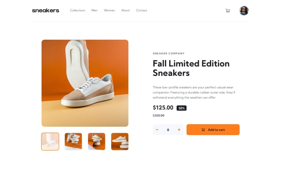
Ecommerce page created HTML, Flexbox, Bootstrap and Vanilla JS
@morgan03
Design comparison
SolutionDesign
Solution retrospective
I found this challenge quite difficult especially with the 'expand image part' where the images expand with a dark background, how the basket changes position on mobile and also putting the icon arrows in a rounded background. Would appreciate some feedback to see how other people approached it!
Community feedback
- @mikester380Posted about 3 years ago
Set a width on the container of the arrow icons and use border-radius: 50%; to make it a rounded circle
Marked as helpful1
Please log in to post a comment
Log in with GitHubJoin our Discord community
Join thousands of Frontend Mentor community members taking the challenges, sharing resources, helping each other, and chatting about all things front-end!
Join our Discord
