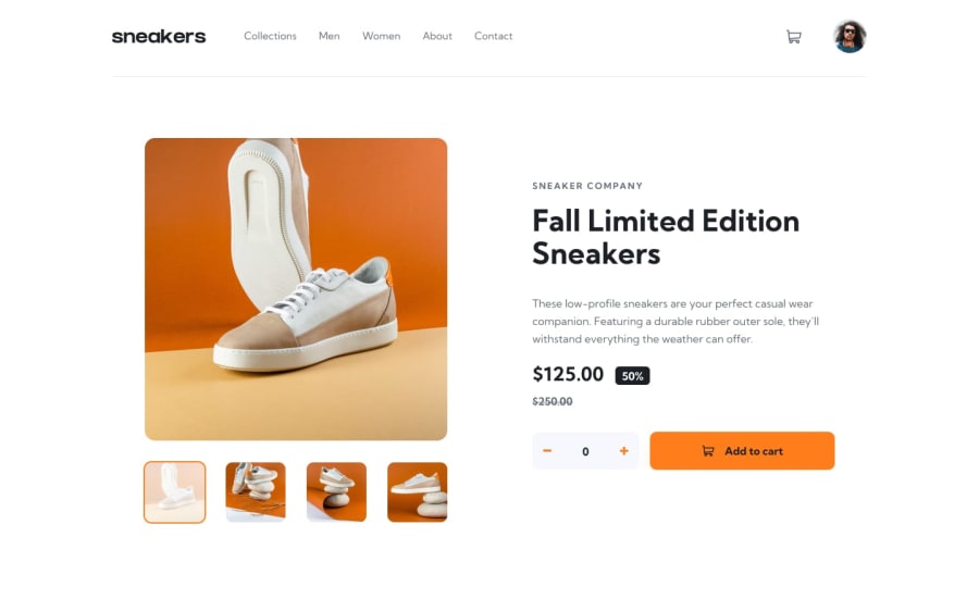
Design comparison
SolutionDesign
Solution retrospective
I thought it was hard, But it turns out easier. The lightbox part was little bit hard, Even though it was hard, I did it without using any framework or libraries... share your thoughts.....
Community feedback
- @Dark-LoverPosted over 2 years ago
each challenge even junior ones could be hard if u want to make it pixel perfect. u did a great job.
try to fix responsiveness
Marked as helpful0@ponnusamy-krishPosted over 2 years ago@Dark-Lover I have set only two break points, only for two versions mobile and pc. Thanks for your valuable feedback and I will Improve my responsive design in upcoming challenges. once again Thank you!
0
Please log in to post a comment
Log in with GitHubJoin our Discord community
Join thousands of Frontend Mentor community members taking the challenges, sharing resources, helping each other, and chatting about all things front-end!
Join our Discord
