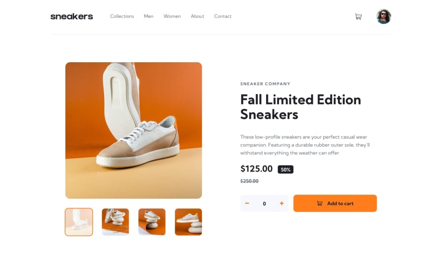
Design comparison
SolutionDesign
Solution retrospective
It was my first time creating this type of page. Any guidance would be helpful.
Community feedback
- @Manik2375Posted over 2 years ago
Hi, to the point here are some things that I'd like to suggest:
- The current product quantity can go below 0, which looks weird.
- Take a look at html-accessibility issues.
- The product page get connected with very bottom, I'd suggest to use some margins/padding
- The backdrop of product images, when scrolling stays at top, perhaps use
position: fixedfor it. - Hover interaction of small thumbnail images, change cursor there.
- They also don't have arrows to change image, which according to design you should have those.
- Cart don't show how many items/or if items are selected or not.
These are what I currently saw, good luck for your next project!
0@arbaz93Posted over 2 years ago@Manik2375 Thank you for your suggestion. I am very grateful. I will work on the things you have pointed out.
0
Please log in to post a comment
Log in with GitHubJoin our Discord community
Join thousands of Frontend Mentor community members taking the challenges, sharing resources, helping each other, and chatting about all things front-end!
Join our Discord
