E-COMMERCE HOMEPAGE WITH SASS, GRID, FLEX-BOX AND JAVASCRIPT
Design comparison
Solution retrospective
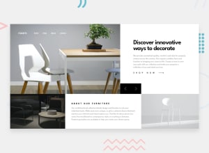
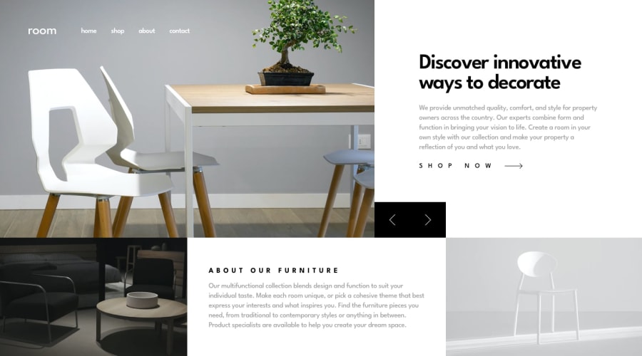
Hi Team. I'm thrilled to have completed an intermediate-level e-commerce homepage challenge. Please I'd be glad to see your feedback.
Community feedback
- @MarcinFiukPosted over 2 years ago
Hi Dike Obinna Clinton
Nice solution, everything looks very nice.
However, I noticed you don't use button for navigation icons only div instead. If you use <button> you would be able to focus on then with keyboard and your solution will be more accessible.
You could also try to separate navigate and buttons from hero slides and style them in relation to <section class="hero">. That will help you avoid repetition and they stay static.
I hope you find that info useful.
Marked as helpful0@Dike-CodePosted over 2 years ago@MarcinFiuk Thanks for the opinions and corrections. I'll look into them.
0
Please log in to post a comment
Log in with GitHubJoin our Discord community
Join thousands of Frontend Mentor community members taking the challenges, sharing resources, helping each other, and chatting about all things front-end!
Join our Discord
