Design comparison
SolutionDesign
Community feedback
- @Adel-Al-QosiPosted over 1 year ago
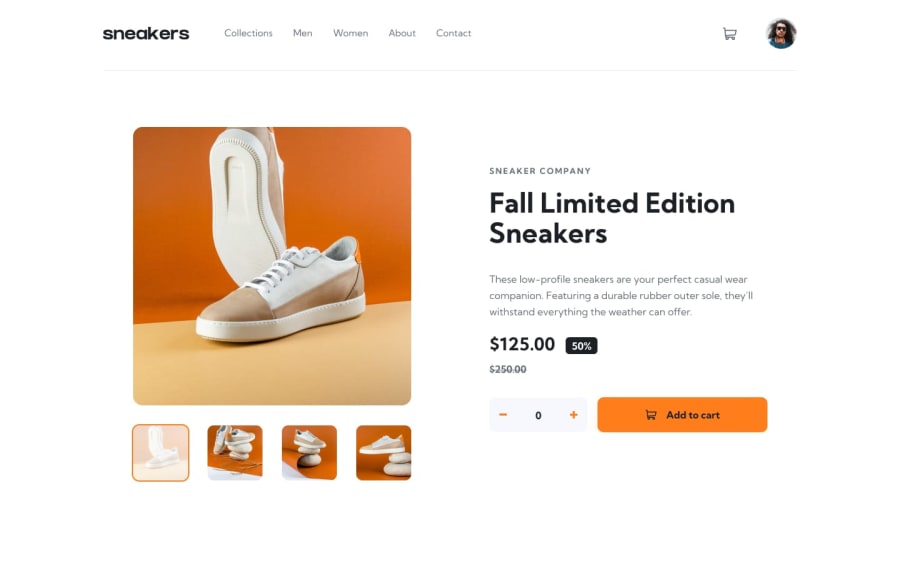
that look good. you can fix the svg color: you can find inside the svg a path tag, and inside the tag you should search for fill then change it to white. that would make it white. also for the prices if they are inside one div give it : align-items: center; with display of flex to make it center
also give the header width of something like 80% or 90% on bigger screens
good job and happy coding
1
Please log in to post a comment
Log in with GitHubJoin our Discord community
Join thousands of Frontend Mentor community members taking the challenges, sharing resources, helping each other, and chatting about all things front-end!
Join our Discord
