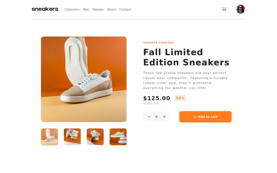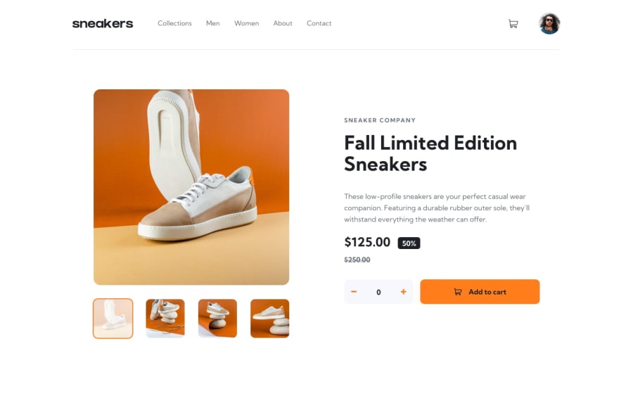
Design comparison
Solution retrospective
While working on this project, I learned a lot about CSS position property, React context API, and the useReducer hook.
🔥 I know I could have made this site more responsive by adding more breakpoints.
🎉 Creating the lightbox gallery was really a challenge for me. I wasn't sure whether do I have to create a separate component or use the images gallery component. Although I finally managed to create it, I am sure there are improvements that can be made.
✨ I couldn't position the cart automatically when resizing the screen.
⭐ I also had a challenge adding shadows for the buttons and cart.
⚡ I would like to add transitions for the aside nav for mobile screen and when sliding through images.
I am also looking forward to learning more from your suggestions.
Community feedback
- @AdrianoEscarabotePosted about 2 years ago
Hi Amos, how are you?
I really liked the result of your project, but I have some tips that I think you will enjoy:
- To improve the accessibility of the project you could have put an h1. Every page must contain a level 1 header, for people who use screen readers, identity what the main title is.
- images must have alt text unless it is a decorative image, for any decorative image each IMG tag must have empty
alt=""and addaria-hidden="true"attributes to make all the assistive technologies of the Web, as screen reader. Learn the differences between decorative/meaningless images vs important content.
The rest is great!
I hope it helps... 👍
Marked as helpful1
Please log in to post a comment
Log in with GitHubJoin our Discord community
Join thousands of Frontend Mentor community members taking the challenges, sharing resources, helping each other, and chatting about all things front-end!
Join our Discord
