

Design comparison

Solution retrospective
- I am proud of completing the challenge and simultaneously learning something new. Initially, I tried doing it a different way by using a single with the
background-imageproperty, but eventually decided to use five individual images for more control over spacing and layout. Although I mentioned that I could have used, it could also have been several elements. Here is the approach I considered but decided not to use due to the limitations in spacing control:
HTML:
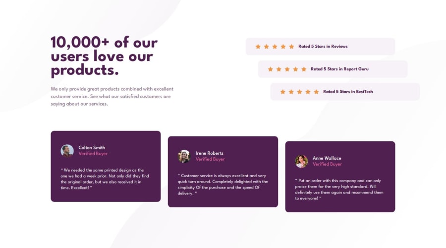
Rated 5 Stars in Reviews
CSS:
What challenges did you encounter, and how did you overcome them?.ratings { display: flex; flex-direction: column; gap: 0.9375rem; } .rating__card { background-color: var(--clr-neutral-light-grayish-magenta); padding-block: 1.625rem; padding-inline: 3.5rem; display: flex; flex-direction: column; align-items: center; justify-content: center; gap: 0.875rem; border-radius: 0.6875rem; } .rating__card__img { background-image: url('../assets/images/icon-star.svg'); width: 100px; height: 1rem; background-repeat: space; }
Despite not having the design in Figma, I decided to use pixel perfect as much as possible using the PowerToys tool, and I am really happy with the result. The downside? The downside is that it took a lot of time and I struggled with taking accurate screenshots of the design. If I decide to do it conventionally, the resolution is not ideal. But if I use Developer Tools and/or device emulation, I face another "problem" where the Desktop (1368 x 768) and Mobile (375 x 667) designs sometimes appear completely different. To the point that on my real mobile device it looks as expected, but when trying to view the same on my laptop, it's not identical.
- What techniques, tricks, resources, or methods do you use to take screenshots of your designs? In my case, I do not have a monitor with
1440or higher resolutions. While I can "adapt" or "modify" these differences compared to smaller sizes, it would also mean creating additional Media Queries, right? - In emulation, there is usually a zoom but often comes with predefined values. How do you handle when you want to use a completely different zoom level? Is there an ideal or special zoom level for these cases?
Community feedback
Please log in to post a comment
Log in with GitHub
Join our Discord community
Join thousands of Frontend Mentor community members taking the challenges, sharing resources, helping each other, and chatting about all things front-end!
Join our Discord