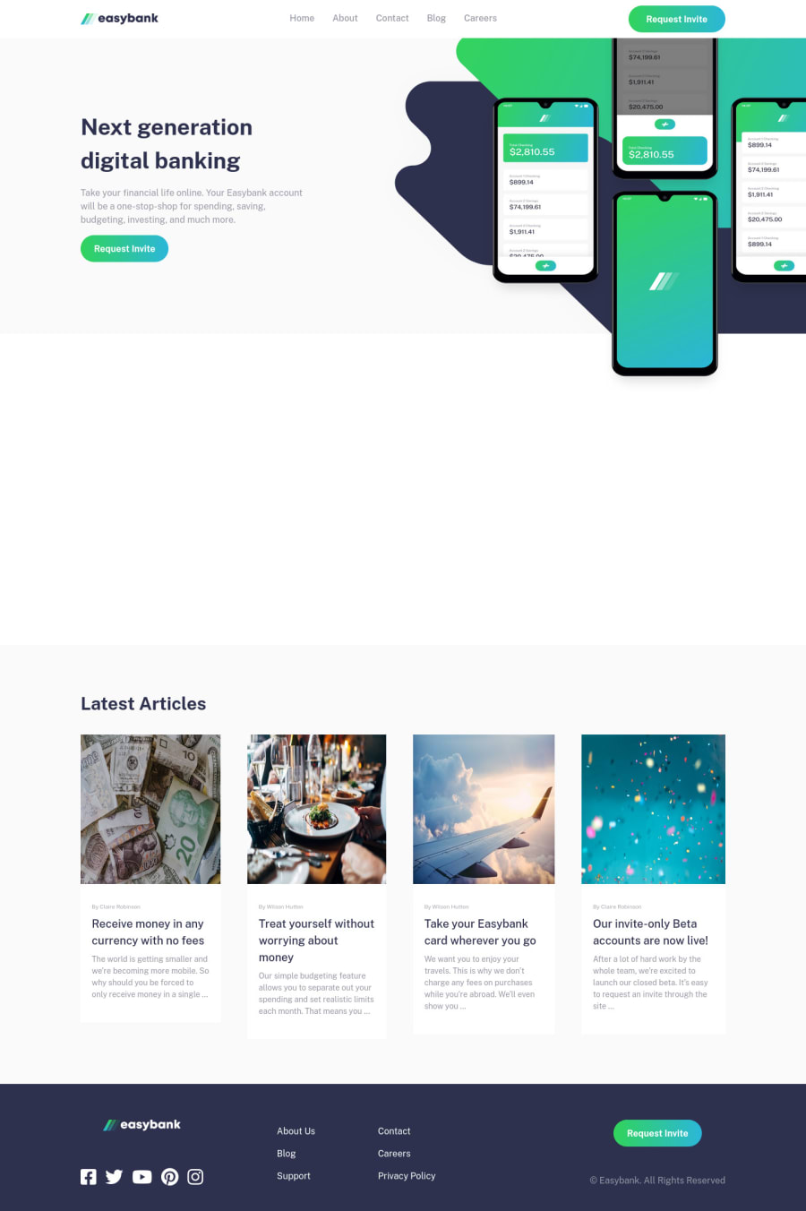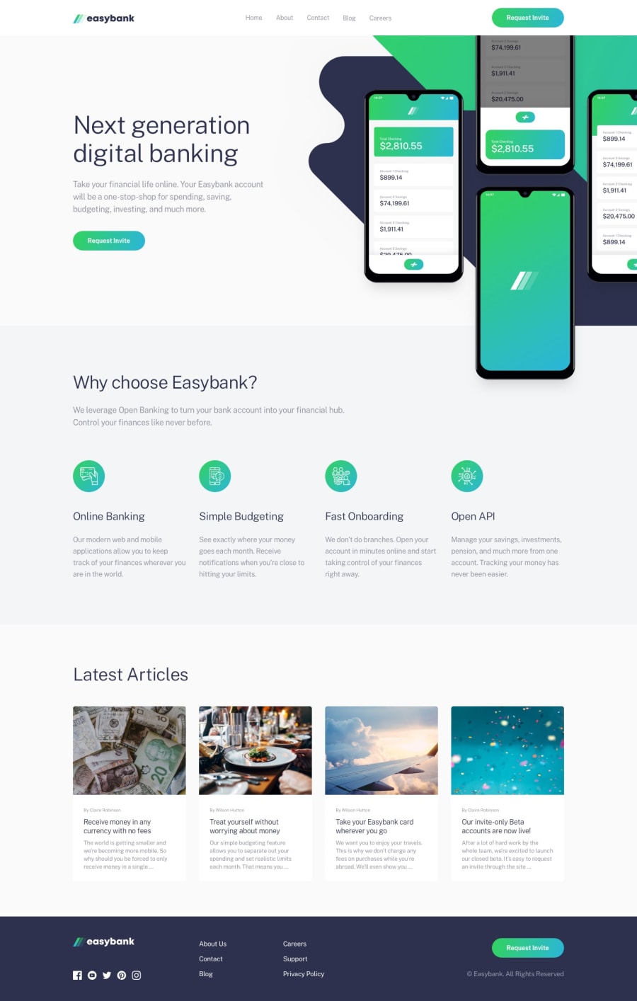
Design comparison
Solution retrospective
Hello. My previous project was the manage landing page.It was similar to this one, but with more work.however I think i i did a better job with this one as in i wrote better css(scss) and solved some of the z-index problems i had previously.In both projects i added smooth scrolling and reveal on load feature using intersectionObserver API.
Community feedback
- @AdrianoEscarabotePosted about 2 years ago
Hi Zijad, how are you?
I really liked the result of your project, but I have some tips that I think you will enjoy:
- The links must have an aria-label or sr-only text that tells where the link navigates the user. For example: Visit our Facebook. For images, you should set aria-hidden=” true” to be ignored by screen readers and to avoid redundancy and repetition.
The rest is great!
I hope it helps... 👍
Marked as helpful0@DelicZijadPosted about 2 years ago@AdrianoEscarabote do basically you are saying that aria-label for links is like the alt text for images?
0@AdrianoEscarabotePosted about 2 years ago@DelicZijad yes, basically that!
Marked as helpful1
Please log in to post a comment
Log in with GitHubJoin our Discord community
Join thousands of Frontend Mentor community members taking the challenges, sharing resources, helping each other, and chatting about all things front-end!
Join our Discord
