Submitted almost 3 years ago
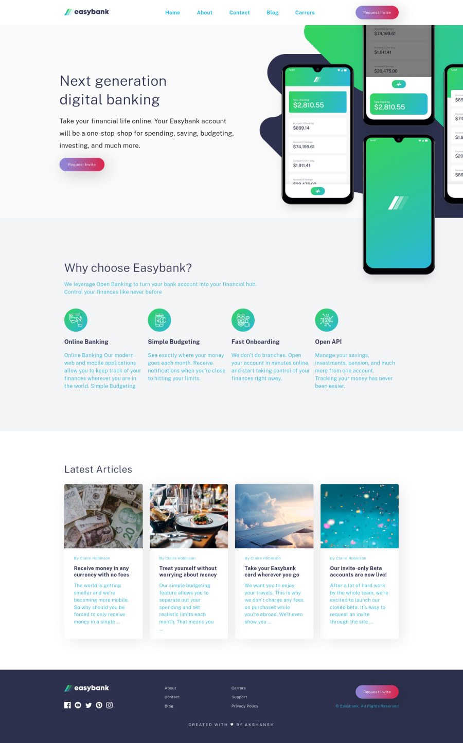
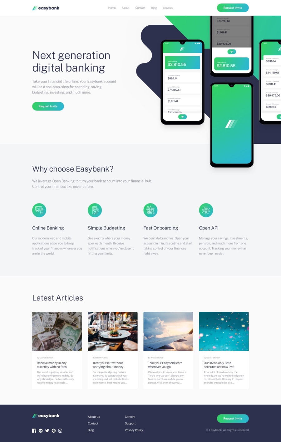
easybank-landing-page-using CSS Grid and flex
@akki251
Design comparison
SolutionDesign
Solution retrospective
There are so many takeaways from this challenged like various overflow properties, like overflow-x : clip positioning of images and elements, The most challenging part was the hero section, rest all was play of grid and flex.
Open to all feedbacks ❤️
Community feedback
Please log in to post a comment
Log in with GitHubJoin our Discord community
Join thousands of Frontend Mentor community members taking the challenges, sharing resources, helping each other, and chatting about all things front-end!
Join our Discord
