


Design comparison
Solution retrospective
Any comments or suggestions are welcome... especially for the backgrounds!! :p
Please log in to post a comment
Log in with GitHubCommunity feedback
- @mauro1998
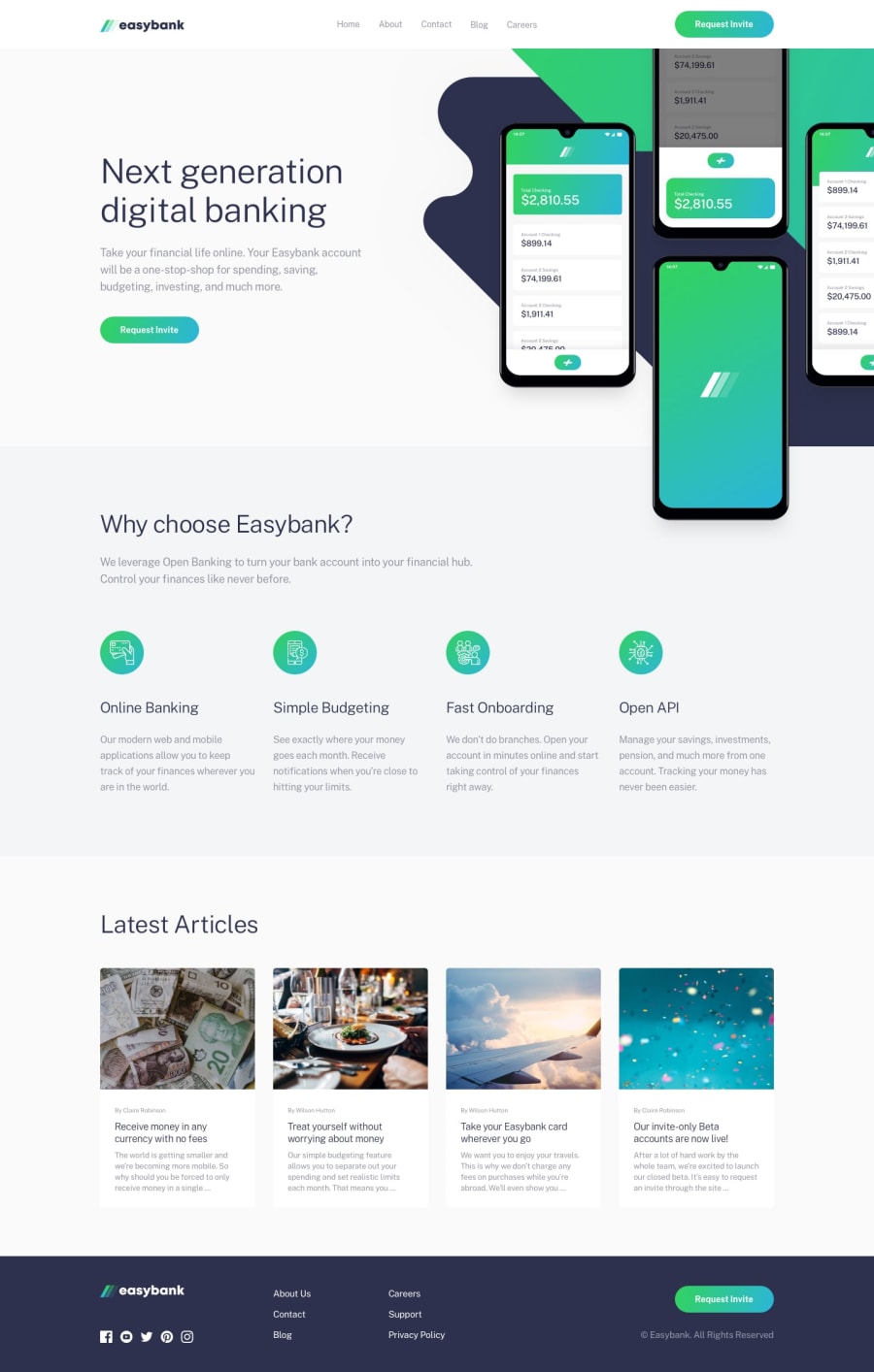
I think you can achieve that background (in desktop mode) by playing with the
background-sizeandbackground-positionproperties but you'd need to change your layout a little bit in some layers:First, I'd make that header a fixed element:
.header {
    position: fixed;
    top: 0;
    background: #fff;
    height: 5rem;
    width: 100%;
    z-index: 1000;
    ...
}
Next, I'd limit the height of the first section:
.section--next {
    background-color: var(--Very-Light-Gray);
    height: 60vh;
    position: relative;
}
Then, I'd start laying out the background images, removing the
<img>and using::beforeand::afterpseudo elements to render the images:.section--next__img { position: relative; width: 100%; height: 100%; } .section--next__img::before { content: ''; position: absolute; top: 0; right: 0; // align to the right width: 35rem; // set a fixed width to work with height: 100%; background-image: url(./images/bg-intro-desktop.svg); background-size: 60rem; // play around til you get the desired size background-position: -50px -115px; // play around til you get the desired position background-repeat: no-repeat; } .section--next__img::after { content: ""; position: absolute; top: 0; right: 0; // align to the right width: 35rem; // set the same width as ::before height: 120%; // add 20% of additional height on this one background-image: url(./images/image-mockups.png); background-repeat: no-repeat; background-size: 35rem; // play around til you get the desired size background-position: 95px 0px; // play around til you get the desired position }and lastly I'd put the text of the first section on top of the background images:
.section--next__info { display: flex; flex-direction: column; align-items: flex-start; gap: 1.77rem; justify-content: center; position: absolute; z-index: 20; padding-top: 5rem; // padding-top same height as the header padding-left: 9.16rem; width: 100%; height: 100%; }Marked as helpful - @mauro1998
Well done!
You can center the green underline of the links no matter the size of the link by doing this:
.nav__link:hover::before { ... right: 0; left: 0; margin: auto; }Marked as helpful

Join our Discord community
Join thousands of Frontend Mentor community members taking the challenges, sharing resources, helping each other, and chatting about all things front-end!
Join our Discord