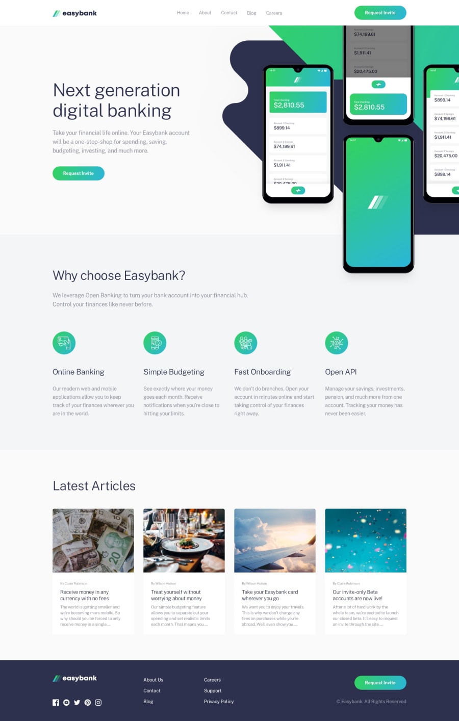
Design comparison
Solution retrospective
This project is one good recalling ability of understanding and practice layout from css .
This sharp ability by increasing disposal skills. And also demands to prepare about how to manage and store data.
But i hit a stone, this for a times now: How to succeed to make a shadowed body spreading under the hamburger menu when trigerred and such a way that it may looks good.
Method selected
I use body:before but i don't get the result
expected. That means an expanded shadowed body going all over the body:before till the end of the webpage design
if someone has advices, i will be thankful for his recommendations .
Hope A nice Day to all and Thanks Dude!
Community feedback
Please log in to post a comment
Log in with GitHubJoin our Discord community
Join thousands of Frontend Mentor community members taking the challenges, sharing resources, helping each other, and chatting about all things front-end!
Join our Discord
