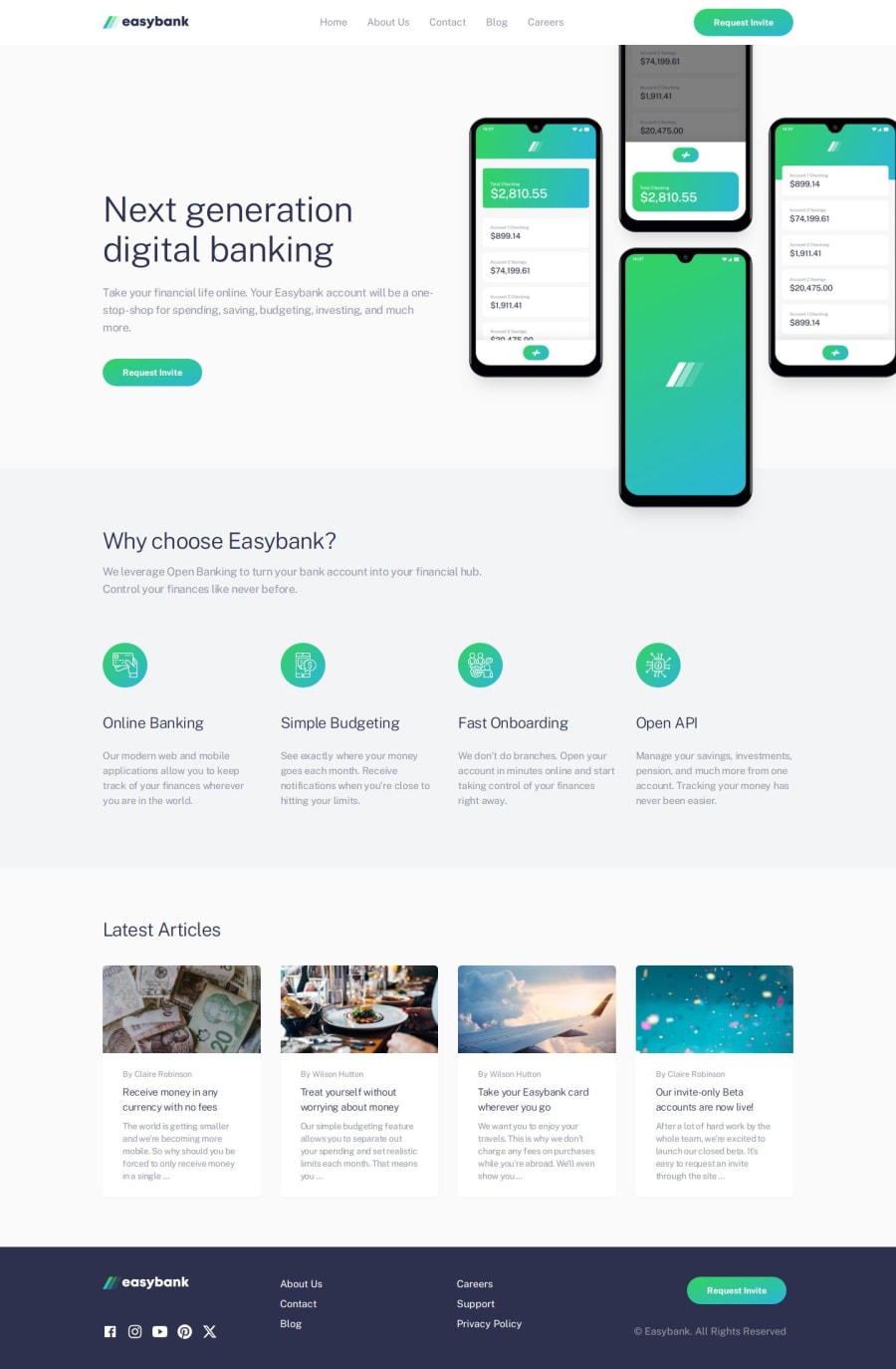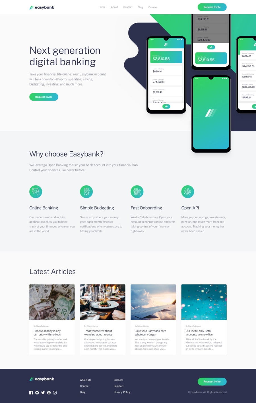
Design comparison
SolutionDesign
Solution retrospective
What are you most proud of, and what would you do differently next time?
I am proud of finishing this project at within 24hours.
What challenges did you encounter, and how did you overcome them?My challenges was:
- Hero section , more with the image. -- i use Grid, i gave it grid-row-[50%,50%] and place the image from its starting point and use overflow-hidden to cut off the outer image offset.
Need help with
- how can i position the Hero background icon.
- z-index and absolute position don't work the way i want, unless there's a better way of using them that i do not know.
Feedback will be appreciated.
Community feedback
Please log in to post a comment
Log in with GitHubJoin our Discord community
Join thousands of Frontend Mentor community members taking the challenges, sharing resources, helping each other, and chatting about all things front-end!
Join our Discord
