


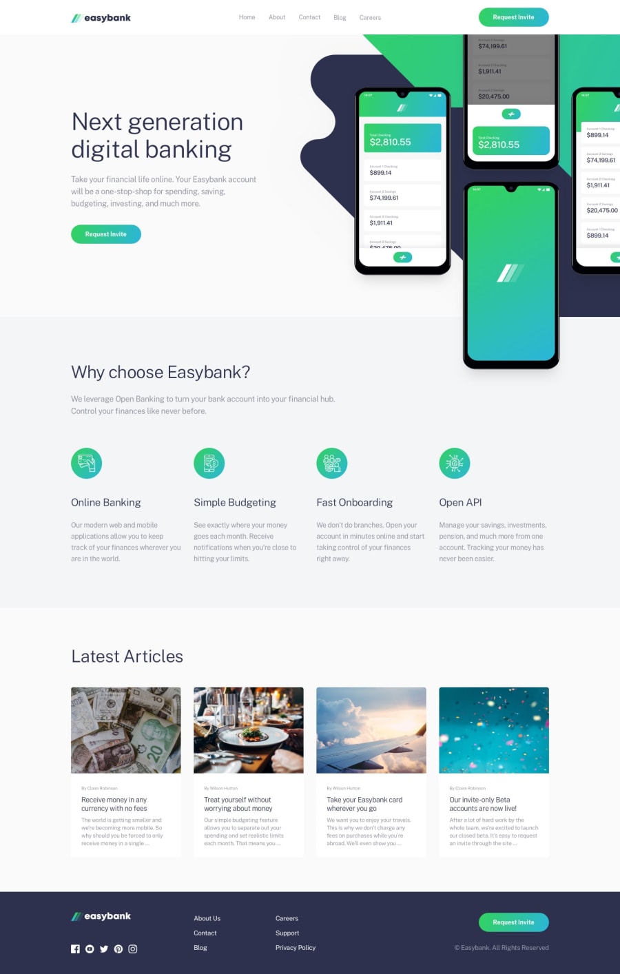
Design comparison
Solution retrospective
I overhauled my previous solution. But I still had difficulty figuring out:
(1) the desktop menu - how do I get the underline to show without shifting the whole menu moving up by 3px?
(2) the mobile phone mockup - right now the image is position:relative but I know there has to be a better way to layout this image. Any suggestions?
(3) Lastly, the footer is far too spaced apart for me - is there a better way to remove some of that extra space without individually accessing the li items?
I would also love for any constructive feedback on what I’ve currently implemented aside from those questions.
Community feedback
- @elaineleungPosted over 2 years ago
Hi Amya, for the footer, if I were to do it I'm most likely use
grid-template-areas. Also, in desktop view I can see that part of your content is overflowing off to the side for certain breakpoints, and the content is cut off. Are you using some sort of container class on each section so that the widths are the same? I do see that the other sections seem to be having the same widths but not the footer, but in the original design it looks like it should. Try something like this:<main> <section> <div class="container"> {section content here} </div> </section> <section> <div class="container"> {section content here} </div> </section> </main> <footer> <div class="container"> {section content here} </div> </footer>That way, the footer and the rest of the sections would have the same styling for the widths.
I also suggest checking out Kevin Powell's YouTube channel as he recently did a tutorial series using one of the challenges on Frontend Mentor, and the layout is similar to this one. Good luck!
Marked as helpful1

Please log in to post a comment
Log in with GitHub
Join our Discord community
Join thousands of Frontend Mentor community members taking the challenges, sharing resources, helping each other, and chatting about all things front-end!
Join our Discord