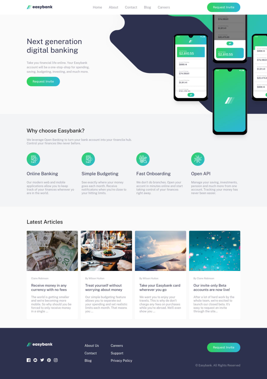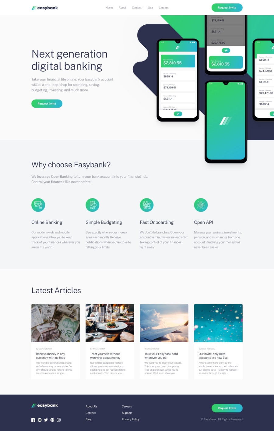
Design comparison
SolutionDesign
Solution retrospective
It is ok that when resizing from desktop to mobile layout, there is a quick flash of the mobile menu? I believe that it is because of the transition and the visibility attributes on the mobile menu. Is there a better solution to this?
What is a good solution for offsetting the background images in this case? At first, I tried to make the image as background on the div tag then place the mockup image on top of it, but I find that way to be a little confusing to I just stuck to use position instead.
Community feedback
Please log in to post a comment
Log in with GitHubJoin our Discord community
Join thousands of Frontend Mentor community members taking the challenges, sharing resources, helping each other, and chatting about all things front-end!
Join our Discord
