


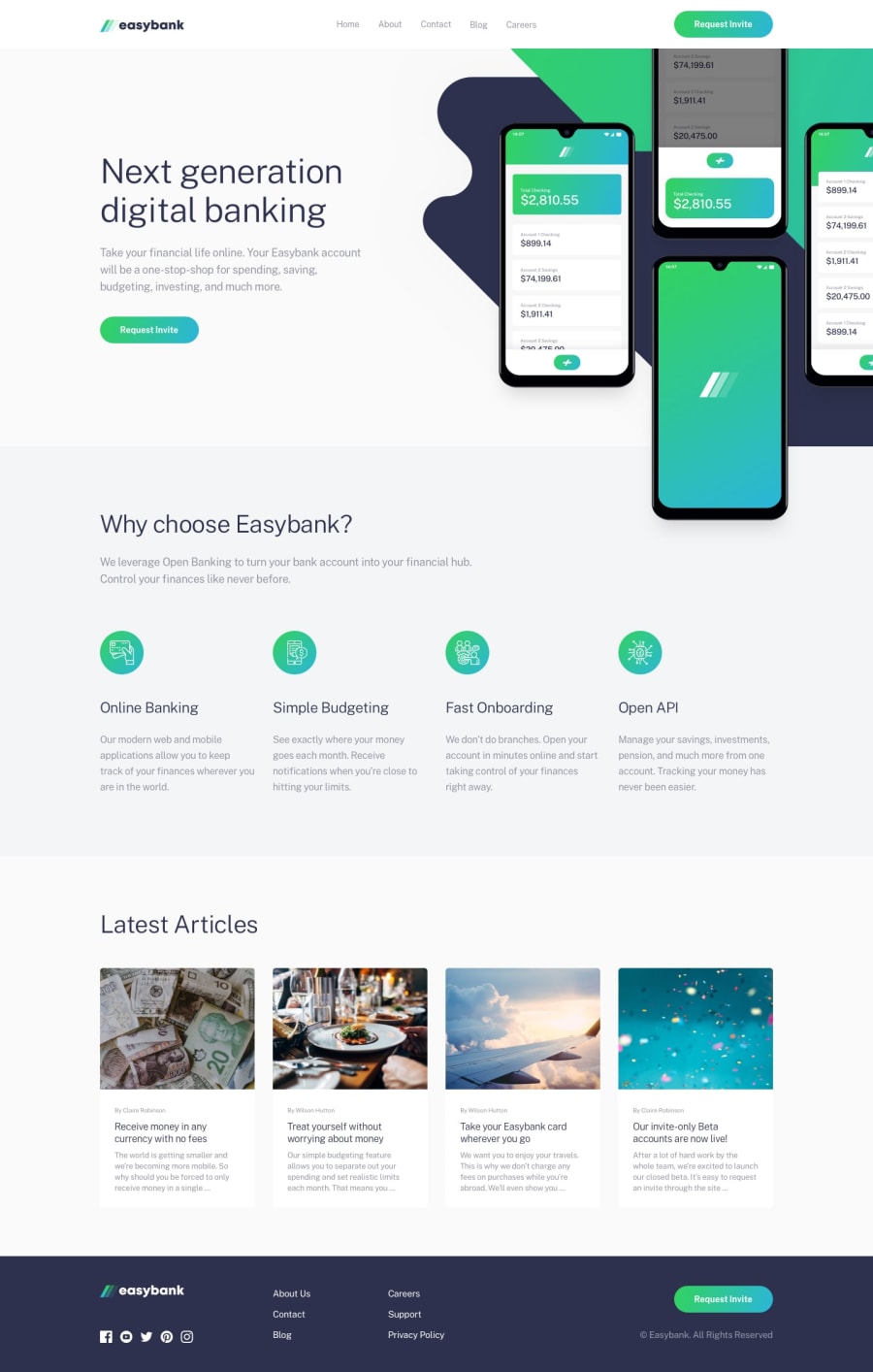
Design comparison
Solution retrospective
What is the best way to structure media queries? I still struggle with the mobile-first approach and setting breakpoints. Any advice would be greatly appreciated.
Community feedback
- @KikcreonPosted over 2 years ago
I think it's good to make it like bootstrap (look here : https://getbootstrap.com/docs/5.2/layout/breakpoints/ )
@media only screen and (max-width: 575px) {} @media only screen and (max-width: 767px) and (min-width: 576px) {} @media only screen and (max-width: 991px) and (min-width: 768px) {} @media only screen and (max-width: 1199px) and (min-width: 992px) {} @media only screen and (max-width: 1399px) and (min-width: 1200px) {} @media only screen and (min-width: 1400px) {}
Marked as helpful0

Please log in to post a comment
Log in with GitHub
Join our Discord community
Join thousands of Frontend Mentor community members taking the challenges, sharing resources, helping each other, and chatting about all things front-end!
Join our Discord