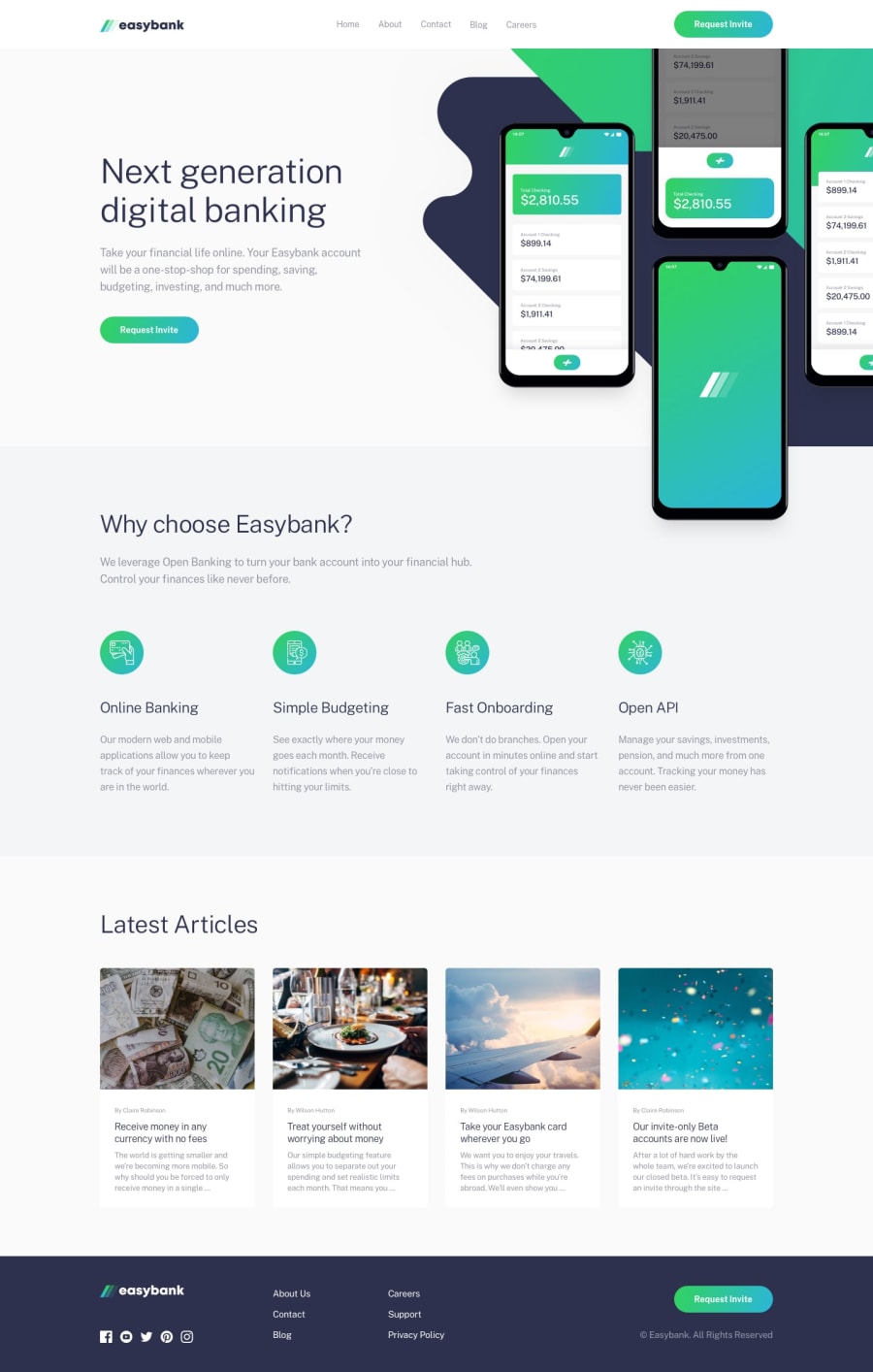
Design comparison
Solution retrospective
This has been a fun project to do. This is my only second project using JavaScript. I have used JS for the mobile navigation toggle. Any feedback from the community would be helpful! Happy Coding!
Community feedback
- @tedikoPosted over 3 years ago
Hello, Suraj! 👋
Well done on this challenge! Your solution responds well. Here's my suggestions:
- Read about semantic. Semantic elements lead to more consistent code, they are easier to read and improve accessibility.
- Set a
max-widthon theheader,.hero__contentetc. containers and center it horizontally so the content of the page doesn't look too stretched on large screens. - Use headings for your
.headand.head-one. - Change your logo image alternative text to be more descriptive. Something like "Easybank - home page" would be good.
Good luck with that, have fun coding! 💪
1 - Account deleted
Hey @Suraj1333,
Great job on this challenge! The design is looking well in comparison with the original design.
I wanted to bring your attention to the navbar animation. It has bug whenever you resize from desktop view to mobile view. What happens is that the navbar animation plays out and the reason for that is because you have animation properties specified inside a media query
@media (max-width:700px){...}To fix this, simply place the animation properties outside of the media query
.nav__links{
    transform: translateX(100%);
    transition: transform 0.5s ease-in;
}
Other than that. I think you did an amazing job with this challenge.
Happy coding!
//Kenny
1@Suraj1333Posted over 3 years agoThis is my first JS project using the animations, so I was not sure about the way things worked. This idea gave me a better understanding. Thank you!!
1
Please log in to post a comment
Log in with GitHubJoin our Discord community
Join thousands of Frontend Mentor community members taking the challenges, sharing resources, helping each other, and chatting about all things front-end!
Join our Discord
