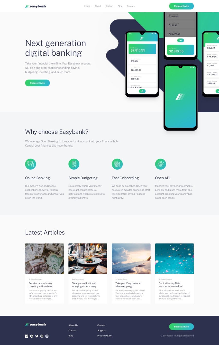
Design comparison
Solution retrospective
Any tips or guides are welcome Please check my code and inform me how can I be better at coding THANK YOU
Community feedback
- @brodiewebdtPosted almost 3 years ago
This looks really good. I had a tough time with this one. The only thing that is off is the blog posts aren't centered on mobile. The HTML errors in the report I think are because there is space between two dashes in your comments. At the end of the comment.
Hope this helps.
Marked as helpful1@sky-1991-siaPosted almost 3 years ago@brodiewebdt thanks a lot for your attention and worthful advice, I fixed HTML errors right now but, I didn't find out where is the issue of posts centered on mobile. overall I will be thankful if you track my future solutions and give me some advice to be a better developer
0 - @brodiewebdtPosted almost 3 years ago
That's what I do. I try to wait as long as possible and figure stuff out on my own. Nothing wrong with using Google.
0 - @brodiewebdtPosted almost 3 years ago
I will look at the code if I get a chance. If you follow me I will return the favor and would be happy to help if I can.
0@sky-1991-siaPosted almost 3 years ago@brodiewebdt of course, why not! Im gona follow and track your codes, i allways learn by reading others codes!
0
Please log in to post a comment
Log in with GitHubJoin our Discord community
Join thousands of Frontend Mentor community members taking the challenges, sharing resources, helping each other, and chatting about all things front-end!
Join our Discord
