Not Found
Not Found
Not Found
Not Found
Not Found
Not Found
Not Found
Not Found
Not Found
Not Found
Not Found
Not Found
Not Found
Not Found
Not Found
Not Found
Not Found
Not Found
Not Found
Not Found

Submitted

Easybank landing page(React JS + Scss + Pixel Perfect + Framer Motion)

@Daniel-Bilodid

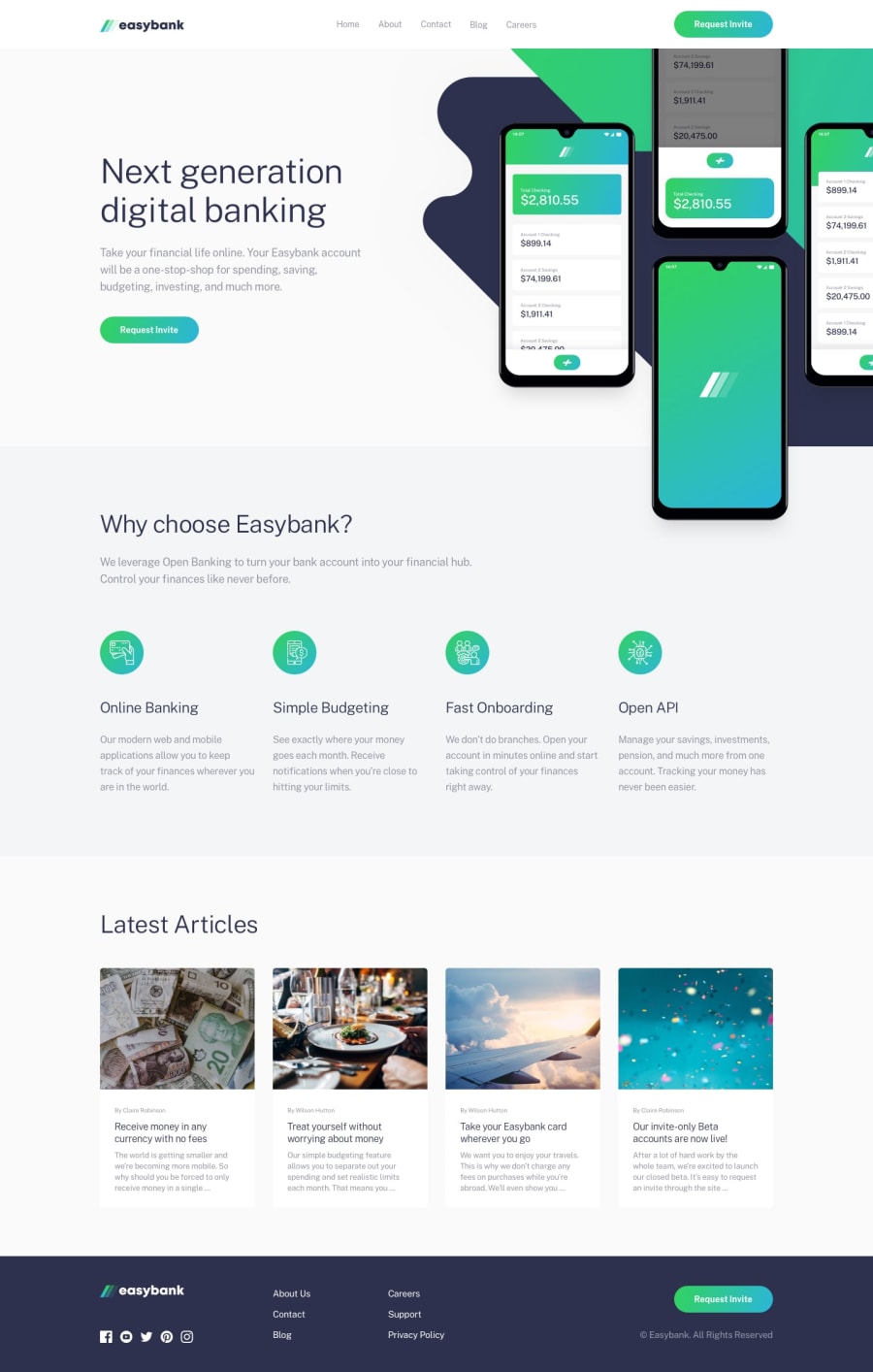
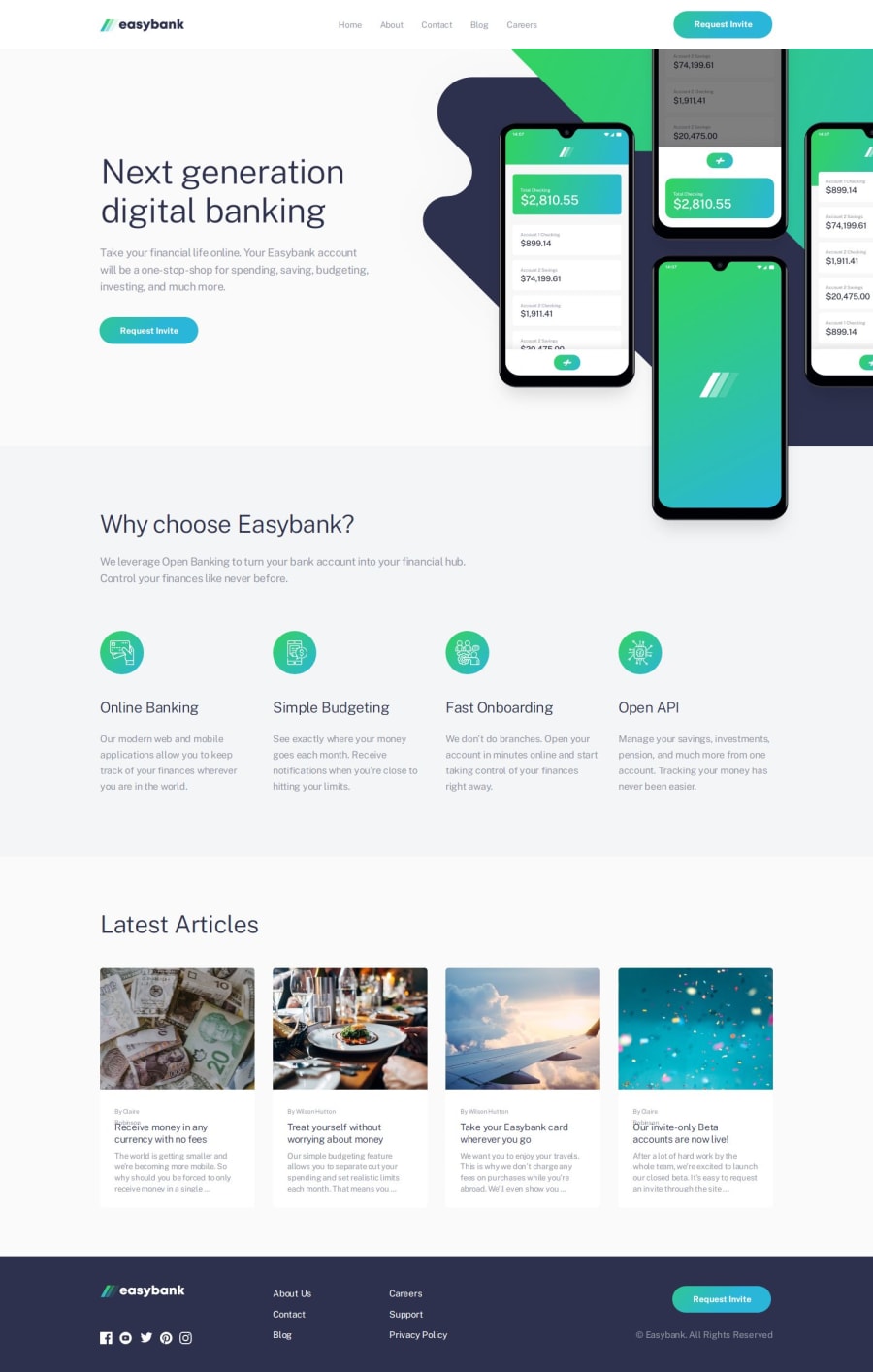
Desktop design screenshot for the Easybank landing page coding challenge

This is a solution for...

  • HTML
  • CSS
  • JS
3intermediate
View challenge

Design comparison


SolutionDesign

Solution retrospective


What are you most proud of, and what would you do differently next time?

๐Ÿง Hello, I'm Daniel this is my solution for this challenge.

๐ŸŽŠ Features:

Achieved +96% in Lighthouse score for performance, accessibility, best practices, and SEO. ๐Ÿ“Š

Animations with Framer motion๐ŸŽฌ

๐—ช๐—ต๐—ฎ๐˜ ๐—ถ ๐˜‚๐˜€๐—ฒ๐—ฑ ๐Ÿ’ป:

React JS.๐Ÿš€

Scss.๐ŸŽจ

ESLint. ๐Ÿ“ฆ

Framer-motion. ๐ŸŽฌ

I really liked accomplishing this project, additionally, I have added the framer motion. Hope you like my solution to this task!

If you have any suggestions on how I can improve my code then I will be very happy.

Community feedback

@VCarames

Posted

Hey there @Daniel-Bilodid! ๐Ÿ‘‹ Here are some suggestions to help improve your code:

I'm sorry to tell you but this "Achieved +96% in Lighthouse score for performance, accessibility, best practices, and SEO." means very little... because you have a lot accessibility and best practice errors in your code... so don't place all your faith in it.

  • You class="nav" should be a header element.
  • The text "logo" is not an appropriate alt text; it should always state the company's name. In this case it should state, "Easybank".
  • The "nav-list" an "nav__button" should be wrapped inside a nav element.
  • The nav toggle should always be a button โš ๏ธ. A div is a non-interactive element, which means that keyboards and accessibility tools cannot interact with it.
  • The nav toggle should also have an aria-label, aria-expanded and aria-control and you will use JS to change the nav state using aria-expanded.
  • There is no need to create two separate nav menus; just create one and use CSS to style it for different breakpoints.
  • If you have the "mobile nav" and change the screen to a larger one the overflow: hidden does not get removed which prevents users scrolling, use JS to remove it a certain breakpoint.
  • The main element should only wrap your page's main content, which does not include the header; so move the header outside the main.

There is still a lot more that needs fixing but this should be enough for now...

Happy Coding! ๐Ÿ‘พ

0

Please log in to post a comment

Log in with GitHub
Discord logo

Join our Discord community

Join thousands of Frontend Mentor community members taking the challenges, sharing resources, helping each other, and chatting about all things front-end!

Join our Discord