Design comparison
SolutionDesign
Solution retrospective
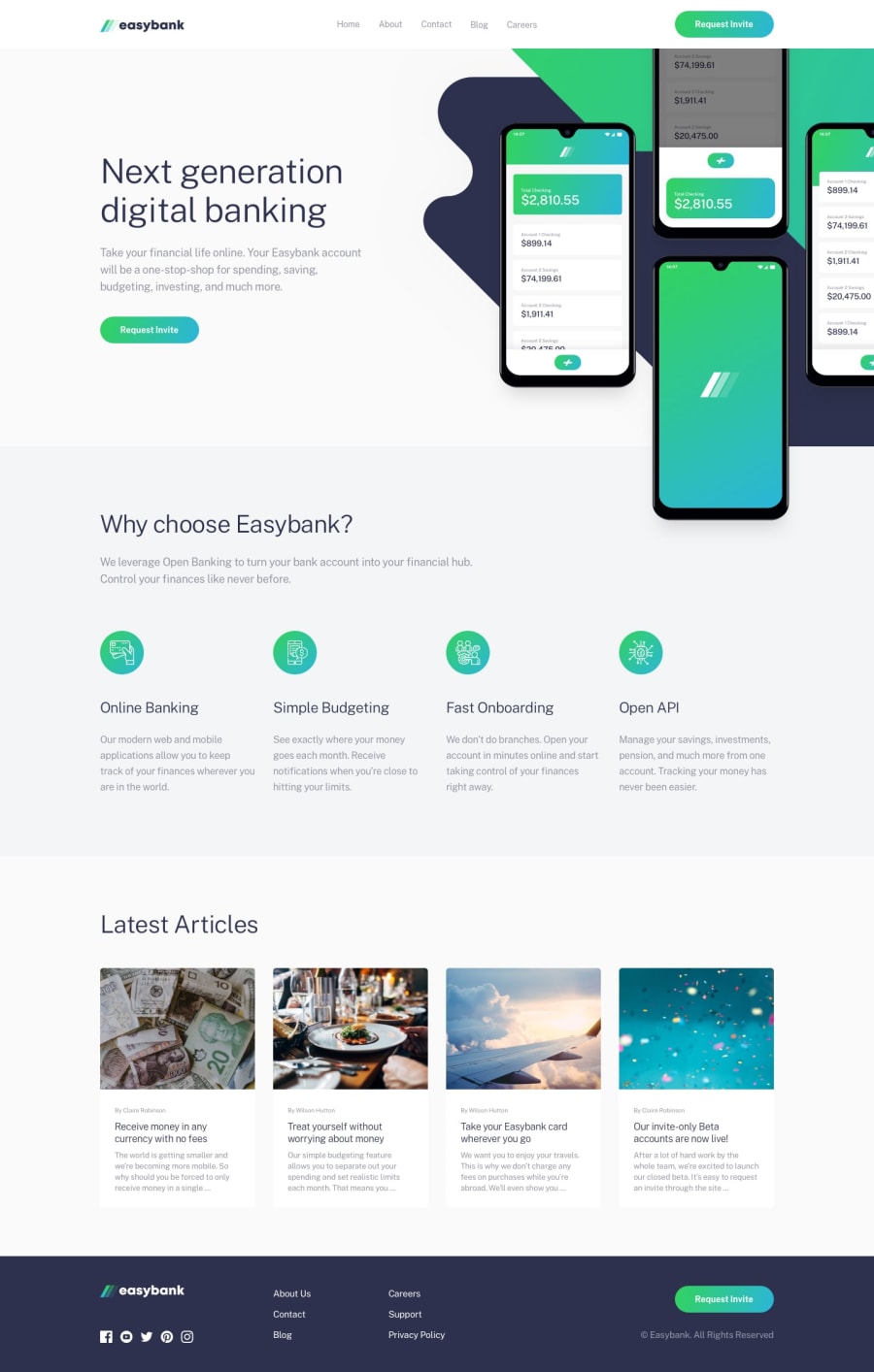
I have completed this challenge... but not so easy.Thanks for any sugestion
Community feedback
- @Dinesh1042Posted over 3 years ago
Hello Sarajlija👋
Fantastic work on this challenge Here are my few suggestion for your solution
- In mobile view your footer has been squashed.
- try adding some more padding on the article card and align your text center.
- Looks great at desktop view 😋.
That's it Great stuff. Happy Coding and Keep Coding🤗
0@sarajlijaPosted over 3 years ago@Dinesh1042 Really footer looks squashed, thanks for suggestion. I will fix that
0
Please log in to post a comment
Log in with GitHubJoin our Discord community
Join thousands of Frontend Mentor community members taking the challenges, sharing resources, helping each other, and chatting about all things front-end!
Join our Discord
