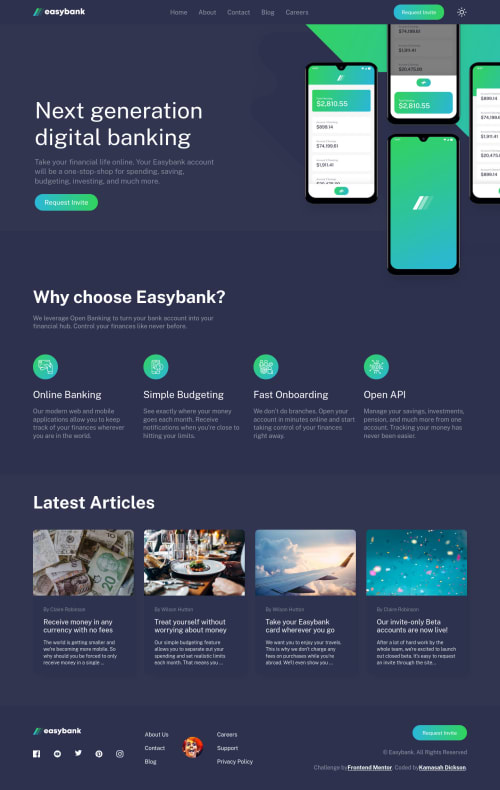
Submitted almost 3 years agoA solution to the Digital bank landing page challenge
Responsive-Easybank-Landing-Page-With-LightMode-Feature
accessibility, react, vite, sass/scss
@Kamasah-Dickson

Solution retrospective
Hello guys😎...I am back with another solution which is the easybank challenge. I added a darkMode feature because I feel like the design deserves one😂....This is my second try on this challenge and I think I like this one more than the other solution. well it's not the best solution but I really need your opinions on it. Merry Christmas to you all in advance, Have a nice day🎉
Code
Loading...
Please log in to post a comment
Log in with GitHubCommunity feedback
No feedback yet. Be the first to give feedback on Kamasah-Dickson's solution.
Join our Discord community
Join thousands of Frontend Mentor community members taking the challenges, sharing resources, helping each other, and chatting about all things front-end!
Join our Discord