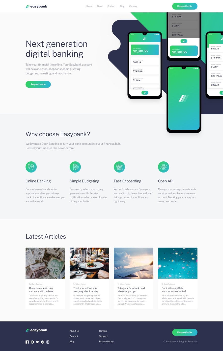
Easybank landing page with viweport measurement units
Design comparison
Solution retrospective
Hi guys, I'm trying to do everything with units from the viewport and I see that so far it's adapting well. In this challenge what gave me problems was the part of the footer links where I wanted to force the flex wrap and I had to give a height with percentages to each element, in principle it looks good, but when the size of the viewport is reduced it looks a little bad, so any advice is welcome.
Community feedback
- @KamaradevPosted about 2 years ago
nicely done if i have on suggestion is to use px or rem units in setting your font-size instead of vw because when the screen get resized the text becomes unreadable. clever use of the checkbox to toggle the tabmenu. over all it is nicely done.
0
Please log in to post a comment
Log in with GitHubJoin our Discord community
Join thousands of Frontend Mentor community members taking the challenges, sharing resources, helping each other, and chatting about all things front-end!
Join our Discord
