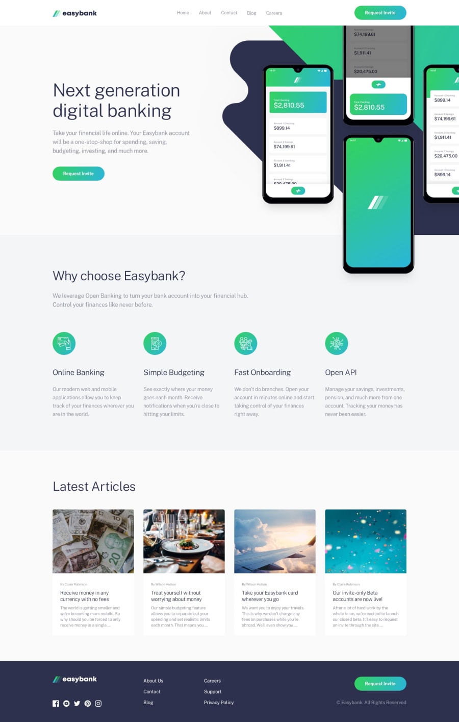
Easybank Landing Page with Vite, CUBE CSS and Fluid Types
Design comparison
Solution retrospective
This project is built upon Semantic html and CUBE CSS methodology with Fluid Types and Spaces. This is a new space, so I am still learning a proper way to organize and maintain a system to scale this to a bigger project.
I found it difficult with Hero image with backgrounds, still try to find a proper way develop without having rely upon fixed units with absolute positioning. I develop the simplest way possible. Please give any feedback to how could it improved to be more responsive.
Trying to not use Media Queries is hard, It is easier to use them, but the design of the website is more flexible without them. Only used them as needed for the Menu and some styling. Let me know the drawbacks of this and would you do things differently.
Learning more about inclusive design and practising them in future challenges.
Thanks.
Community feedback
Please log in to post a comment
Log in with GitHubJoin our Discord community
Join thousands of Frontend Mentor community members taking the challenges, sharing resources, helping each other, and chatting about all things front-end!
Join our Discord
