Submitted over 2 years ago
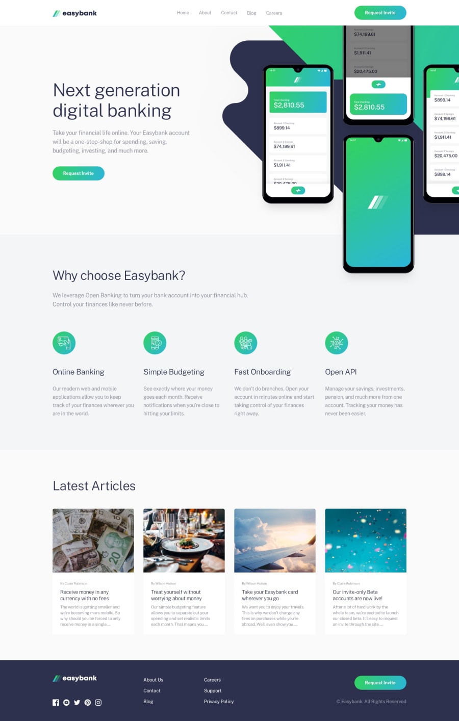
Easybank Landing Page with Tailwind.css and Alpine.js
#accessibility#tailwind-css
@wendyhamel
Design comparison
SolutionDesign
Solution retrospective
Pfew, a lot of layout shifts! Nice practice for complicated layouts with background images, grids and overlapping sections.
Community feedback
- @brasspetalsPosted over 2 years ago
Hi, Wendy! 👋 Nice job on this one! It responds great, which I know was definitely tricky. 👍
I know next to nothing about Tailwind and Alipine, so I can't comment on your use there. However, poking around the layout I managed to find a few minor things to improve on:
- I believe the desktop nav links have a gradient on the bottom in the design - not just green. Although there are a few ways to achieve this, I suggest looking into the
border-imageproperty in combo with alinear-gradient. - The article titles should be links with a green hover state.
Like I said, very minor stuff. Again, great job on this one! 😄
Marked as helpful1@wendyhamelPosted over 2 years ago@brasspetals Thanks for looking at my solution! I didn't see the gradient and didn't notice the links for the article titles. I will take a look!
1 - I believe the desktop nav links have a gradient on the bottom in the design - not just green. Although there are a few ways to achieve this, I suggest looking into the
Please log in to post a comment
Log in with GitHubJoin our Discord community
Join thousands of Frontend Mentor community members taking the challenges, sharing resources, helping each other, and chatting about all things front-end!
Join our Discord
