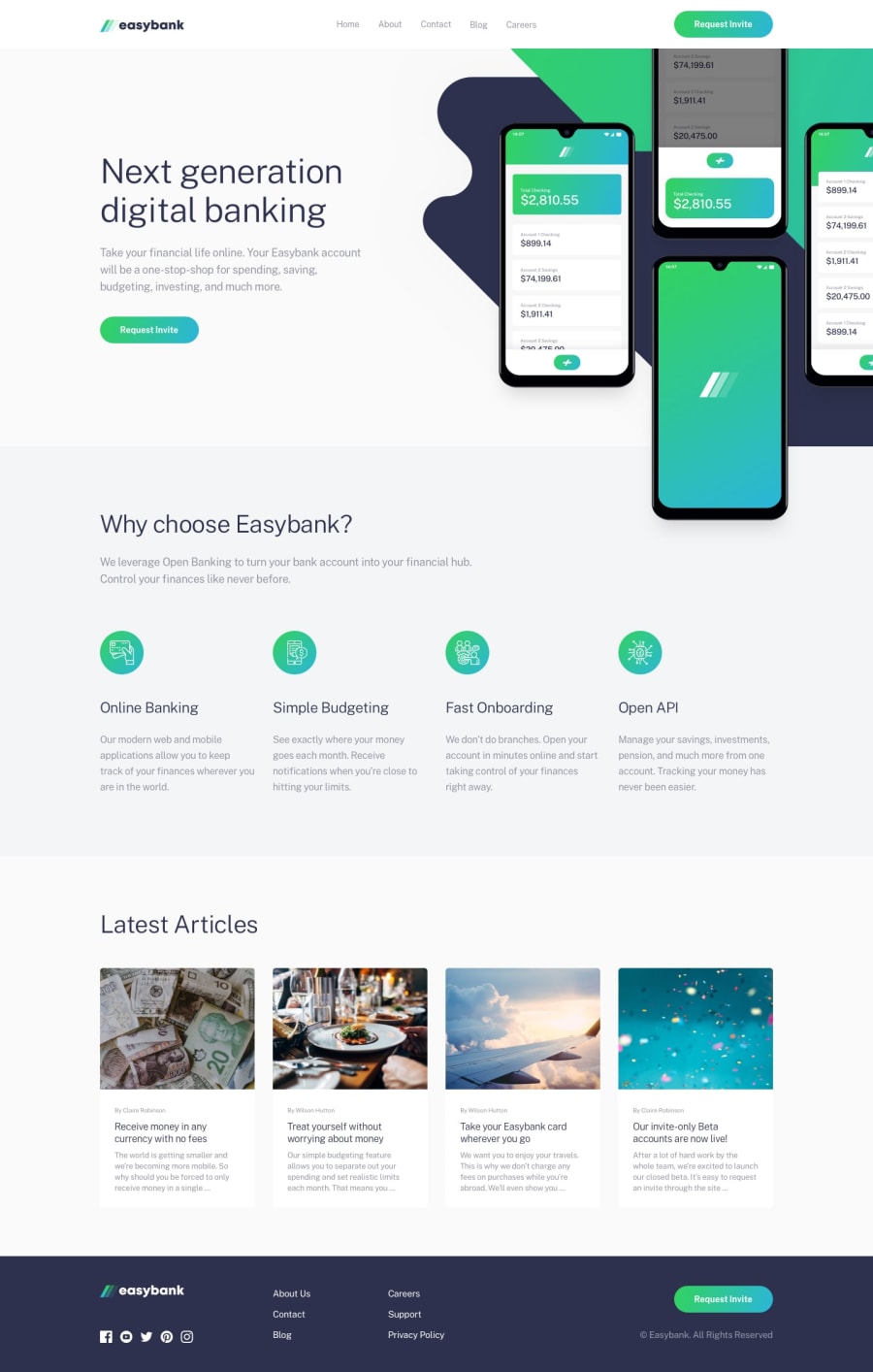
Design comparison
SolutionDesign
Solution retrospective
Hello everyone,
I tried some new methods for this project.
- ripple effect for all buttons that is only visible on devices that uses a touchpad
- used intersection observer so that the articles fade in when you scroll down to them
- gradient color with transition on hover for the links and svg images in the footer
Community feedback
Please log in to post a comment
Log in with GitHubJoin our Discord community
Join thousands of Frontend Mentor community members taking the challenges, sharing resources, helping each other, and chatting about all things front-end!
Join our Discord
