Submitted almost 4 years ago
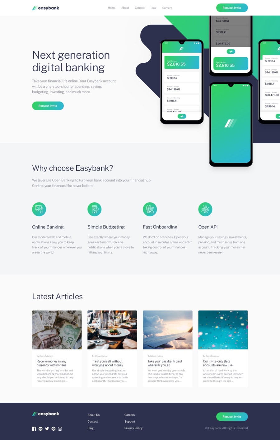
Easybank Landing Page with Sass and CSS Flexbox
@soodaayush
Design comparison
SolutionDesign
Solution retrospective
I don't know JavaScript so there won't be any of that there. Any feedback would be appreciated.
Community feedback
- @DucknaroPosted almost 4 years ago
good job bro but as you might have noticed, it's not responsive, if you make it responsive it will look even nicer, good job though
0 - @harika09Posted almost 4 years ago
Good job on this one.
some recommendation to improve it.
- try not fix the illustration image when display on bigger sizes display it will zoom it. 2.add spacing on your navigation menu. 3.add spacing on the latest articles card.
- make it responsive.
overall this was great! Happy coding!
0
Please log in to post a comment
Log in with GitHubJoin our Discord community
Join thousands of Frontend Mentor community members taking the challenges, sharing resources, helping each other, and chatting about all things front-end!
Join our Discord
