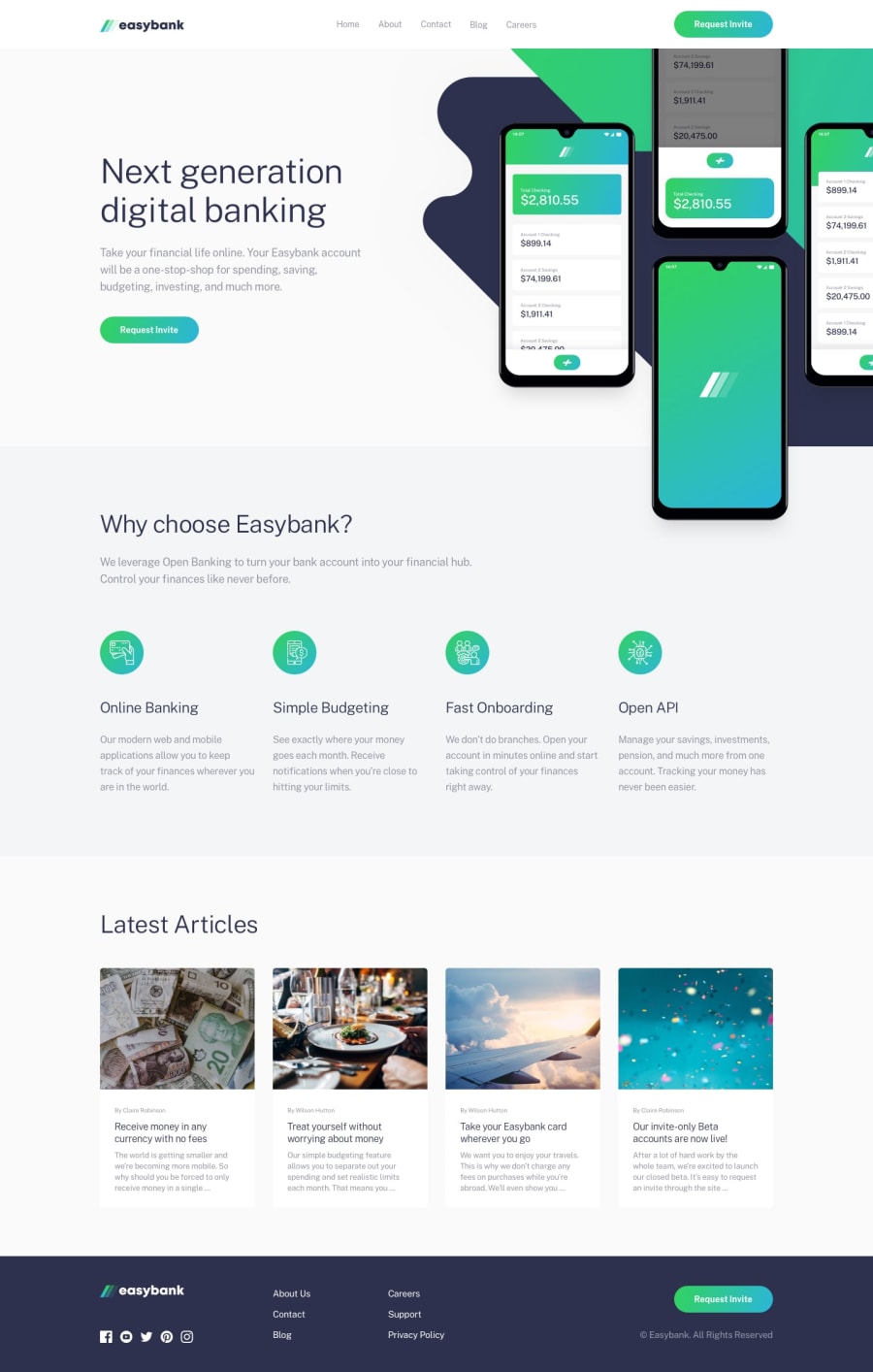
Design comparison
SolutionDesign
Solution retrospective
I tried to make the mock-up image's position match the design files and I found out css overflow properties are not friendly lol.
Community feedback
- @deanhopesPosted over 4 years ago
10/10
What you did well
- Hero image flipped works better than the original
- Much better spacing between the main header, body text, and button on the hero
- I'm hoping to get to your level soon as I'm not great at coding but have a background in design
Criticism
- You've given the navbar more breathing room but it might be too spacy now?
- Is there enough space between the "Why choose easybank" section and the hero? I think the original is slightly better to the eye.
- Same with "latest articles". More 'whitespace' needed.
Awesome work I think. Something to aspire to :)
2
Please log in to post a comment
Log in with GitHubJoin our Discord community
Join thousands of Frontend Mentor community members taking the challenges, sharing resources, helping each other, and chatting about all things front-end!
Join our Discord
