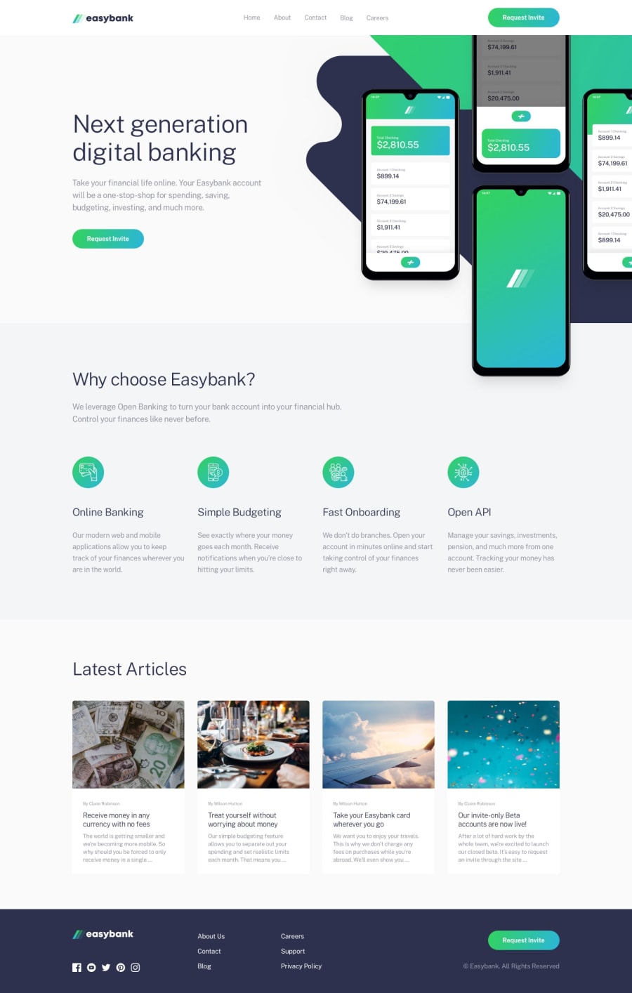
Design comparison
SolutionDesign
Solution retrospective
I am still a beginner at React JS and unfortunately the mobile version of the navbar drove me mad:(
I appreciate any tips or suggestions. Thank you!
Community feedback
- @0xabdulkhaliqPosted over 1 year ago
Hello there 👋. Congratulations on successfully completing the challenge! 🎉
- I have other recommendations regarding your code that I believe will be of great interest to you.
ID ATTRIBUTE 🛑:
- The
idattribute uniquely identifies elements on a page. It does not make sense to duplicate anid.
- Duplicate
id's can break the accessibility of labels for forms, table header cells, etc.,
- To fix the problem, change an
idvalue if it is used more than once to be sure each is unique. Uniqueid's differentiate each element from another and prevent invalid markup
- Ensures that each element on the page with an
idattribute has a uniqueidattribute value.
HEADINGS ⚠️:
- This solution has generated accessibility error report due to skipping heading levels which warn us as "Heading levels should only increase by one"
- We want to avoid skipping heading levels, make sure to start with
<h1>and working your way down the heading levels (<h2>,<h3>, etc.) helps ensure that our document has a clear and consistent hierarchy. Read more 📚
- Because skipping heading levels is a poor practice from the perspective of information design, whether we are talking about web pages, books, journal articles, or about anything else. You can not only confuse screen readers but all readers when you don't follow a consistent, logical pattern with your heading structure.
.
I hope you find this helpful 😄 Above all, the solution you submitted is great !
Happy coding!
0
Please log in to post a comment
Log in with GitHubJoin our Discord community
Join thousands of Frontend Mentor community members taking the challenges, sharing resources, helping each other, and chatting about all things front-end!
Join our Discord
