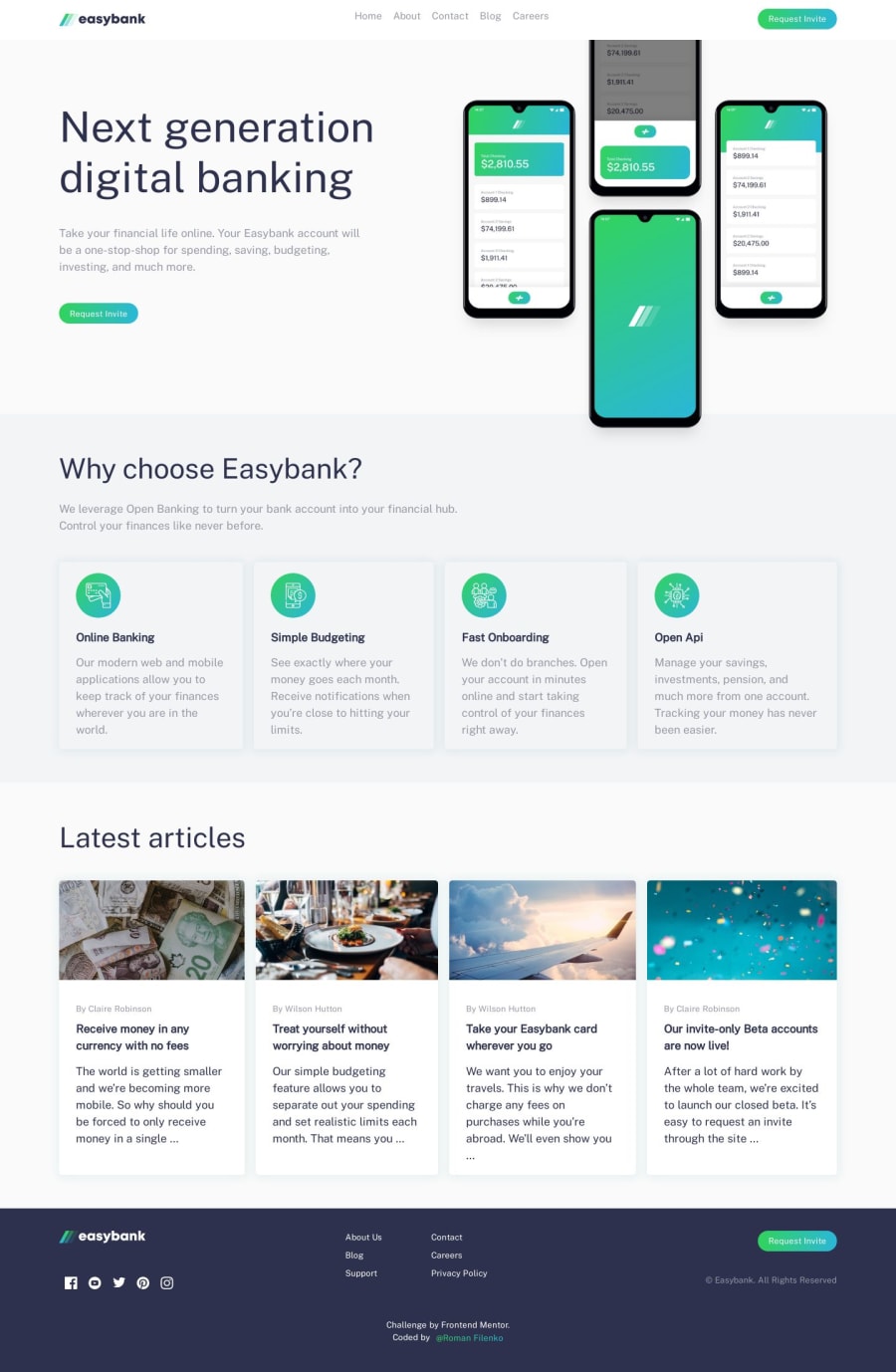
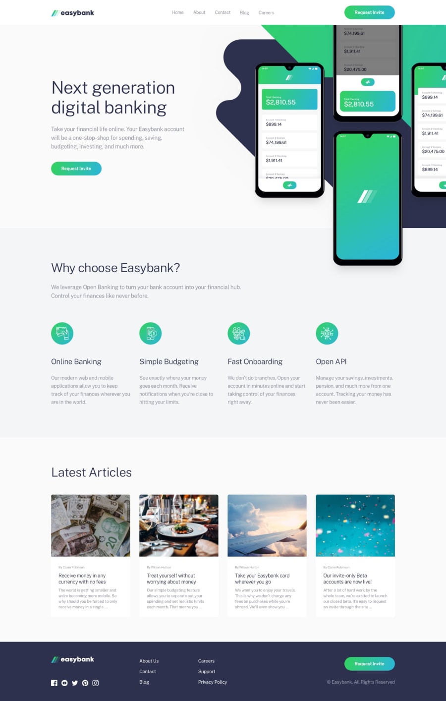
Easybank landing page with NuxtJS, Tailwind CSS


Design comparison
Solution retrospective
My second solution submitted. Are there any accessibilty issues? Will be glad for feedback:)
Community feedback
- P@shashiloPosted almost 5 years ago
Good job on the implementation. The next step you'll need to take is being pixel perfect. The font sizes, font weight, line height, button padding, etc. are a little off from the design. Also, on mobile, theirs many little styles that do not align with the design. I know this is being picky, but when you've worked with plenty of picky designers, you want to be as accurate as possible to get them off your back.
0@rfilenkoPosted almost 5 years agoHi shasilo, thanks for your feedback, I've made some different design decisions, specially on mobile, so that's why it doesn't matches perfectly. Original source figma file would also help))
0P@shashiloPosted almost 5 years ago@rfilenko I totally understand you wanted to make different design decisions, but in my experience, designers do not want you to tweak their designs unless you consult them on it first.
0

Please log in to post a comment
Log in with GitHubJoin our Discord community
Join thousands of Frontend Mentor community members taking the challenges, sharing resources, helping each other, and chatting about all things front-end!
Join our Discord