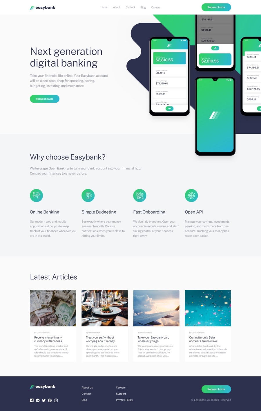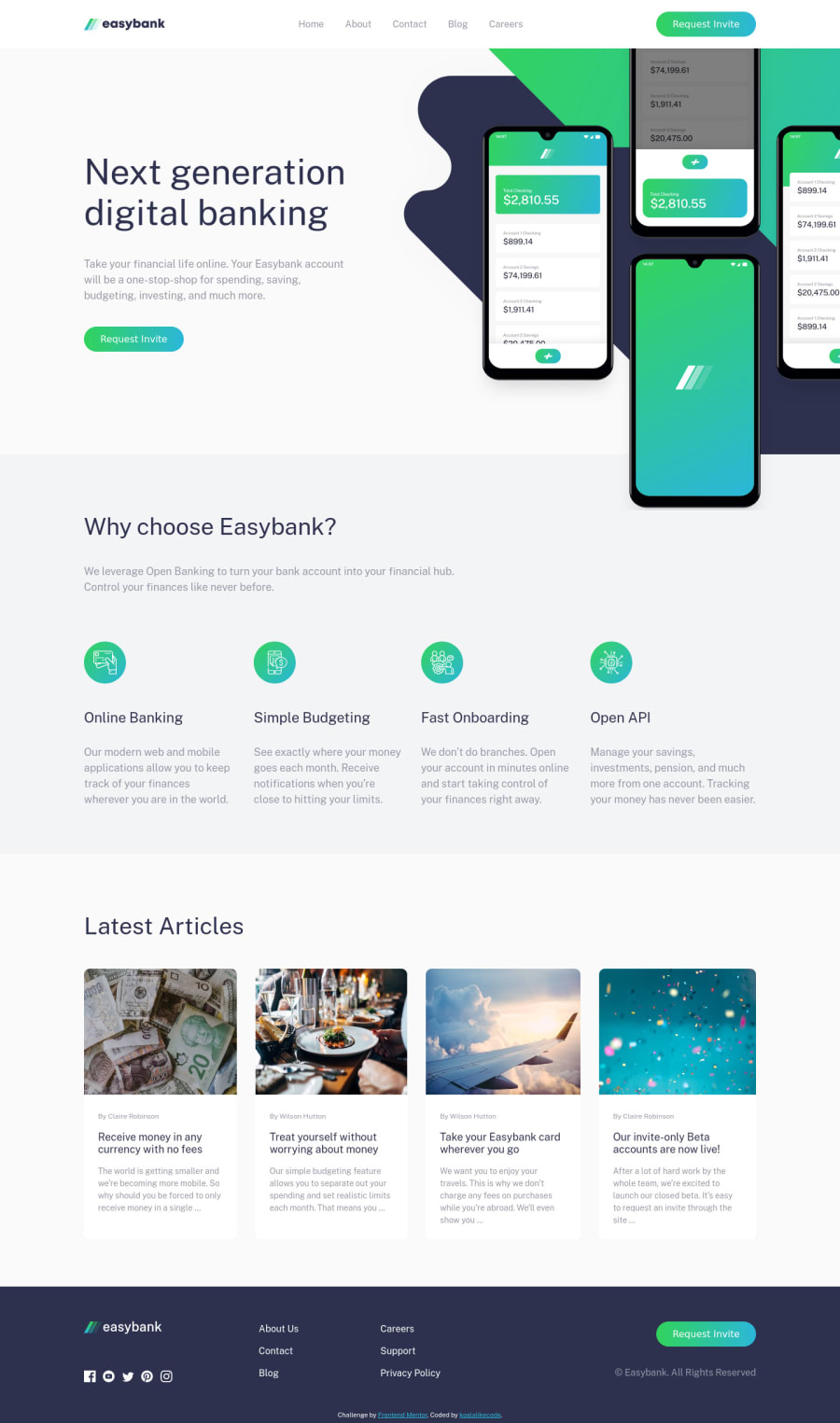
Easybank landing page with Html, css and vanilla Javascript
Design comparison
Solution retrospective
Hello guys, This is a wonderful challenge for practicing layout skills. I have made adaptive mobile on my computer but I wonder why my phone's layout doesn't look like the PC's. I appreciate any advice and suggestions. Thank you!
Community feedback
- @pikapikamartPosted about 3 years ago
Hey, great work on this one. Layout in desktop is good, and the mobile state seems fine. Though resizing, some elements are being too squished, especially the articles on the bottom part. You might want to adjust them, you could make a 2x2 layout for those in the responsive part before going in mobile layout, that would make the layout feel more great.
Some suggestions would be:
- The website logo in the
header
should havealt="easybank"
. The image itself already has the text, better using it. Also, avoid adding words that relates to "graphic" such as "logo, image, icon, picture".. as aalt
value. Assistive tech will handle those for you. - The
header
links should be inside anav
and inside aul
element:
<nav> <ul> { each link inside their own li element } </ul> </nav>
request invite
should be a linka
tag and notbutton
since it doesn't control anything in there. It would bebutton
if it is modal, but it is more likely to be link.- The other
request invite
should bea
tag as well. - On the articles section, it would be really great to make each article use an
article
tag and it should be inside aa
tag:
<a> <article> { element being wrapped by article } </article> </a>
FOOTER
- Website logo
img
tag should usealt="easybank"
. - The social media links should be wrapped inside their own
a
tag, because those are links. Eacha
tag should havearia-label
pointing to what link it will go, like on thea
that will wrap the facebook, it should havearia-label="facebook"
. They should be all inside aul
element as well, since they are list of social media links. - The other links should be inside
a
tag as well, but within thenav
andul
like I mentioned above.
MOBILE STATE
- The hamburger menu should be using
button
element. Usingimg
alone is not accessible. - The hamburger menu as well should have
aria-label="hamburger dropdown toggler"
like that, so that users will know what thisbutton
will do. It also should havearia-expanded
attribute, changing the value of that in the javascript. That will inform the user that a dropdown has expanded. - The ordering of your hamburger dropdown toggler and the navbar links is wrong. The toggler should be before the navbar links in your html.
Aside from those, great work.
Marked as helpful1@koalalikecodePosted about 3 years ago@pikamart Thank you for all your advice, I appreciate it very much! There are some attributes you mentioned that I haven't heard before such as 'aria label' and 'aria expanded'. Thanks for your suggestions, I will improve my skills more.Happy coding!
0 - The website logo in the
Please log in to post a comment
Log in with GitHubJoin our Discord community
Join thousands of Frontend Mentor community members taking the challenges, sharing resources, helping each other, and chatting about all things front-end!
Join our Discord