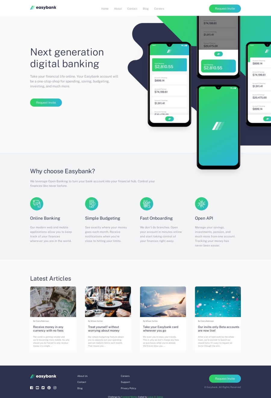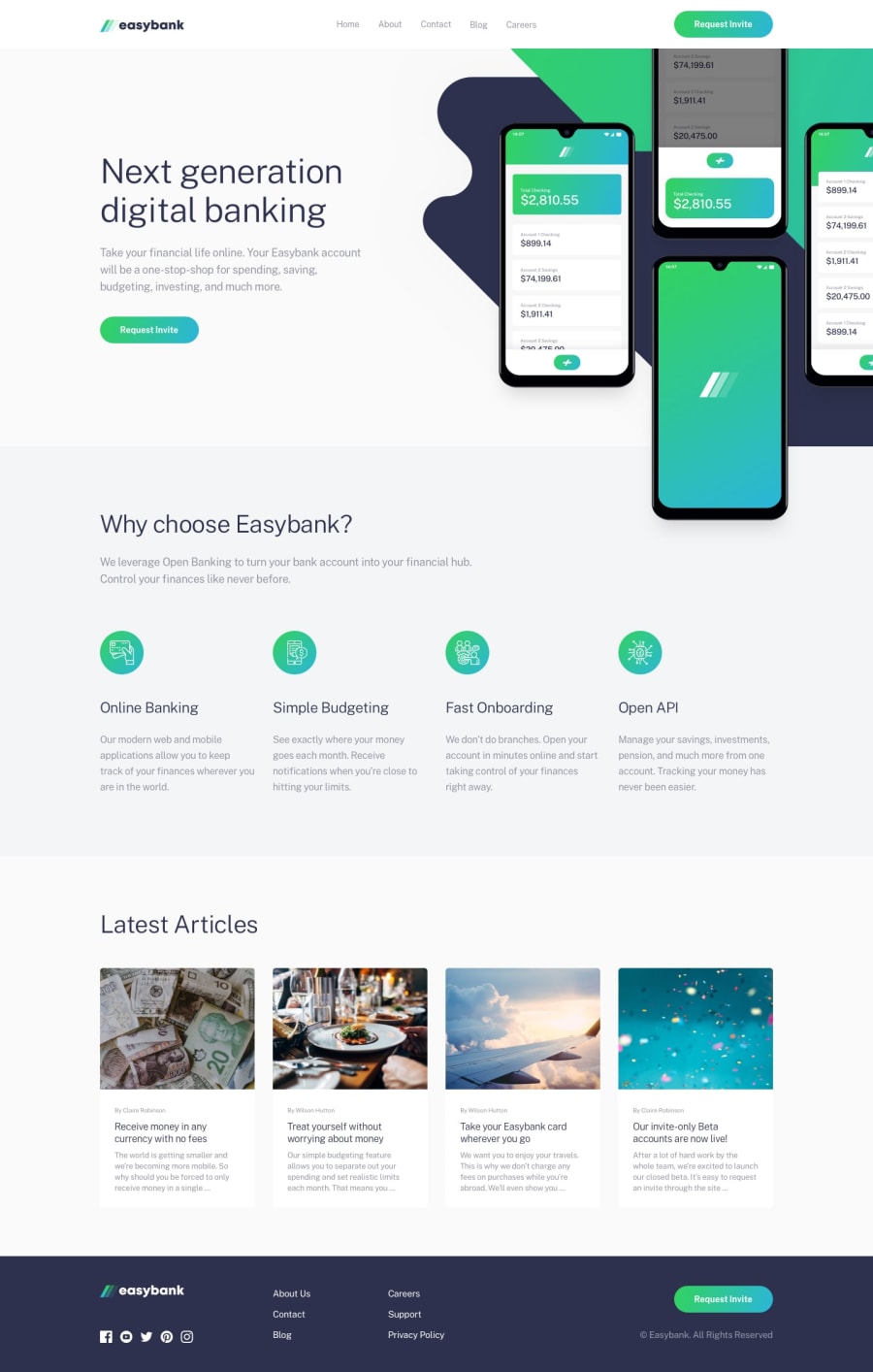
Design comparison
Community feedback
- @mattstuddertPosted over 4 years ago
Awesome work on this challenge, Lucas! Your solution looks really good. My main recommendations revolve around accessibility. I'd recommend trying to resolve the accessibility errors in the report. Also, you're currently triggering the mobile navigation with a click event on a
div. This makes that content inaccessible to anyone who physically can't click on the element. Instead, I'd recommend using an interactive element, like abuttonto trigger this action. If you want an example, feel free to look at the source code on this site for how I handle the mobile navigation.Keep up the great work! 👍
1@gomezlucasPosted over 4 years ago@mattstuddert Thanks very much, Matt! I ll make those changes so
0
Please log in to post a comment
Log in with GitHubJoin our Discord community
Join thousands of Frontend Mentor community members taking the challenges, sharing resources, helping each other, and chatting about all things front-end!
Join our Discord
