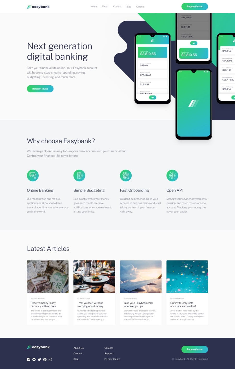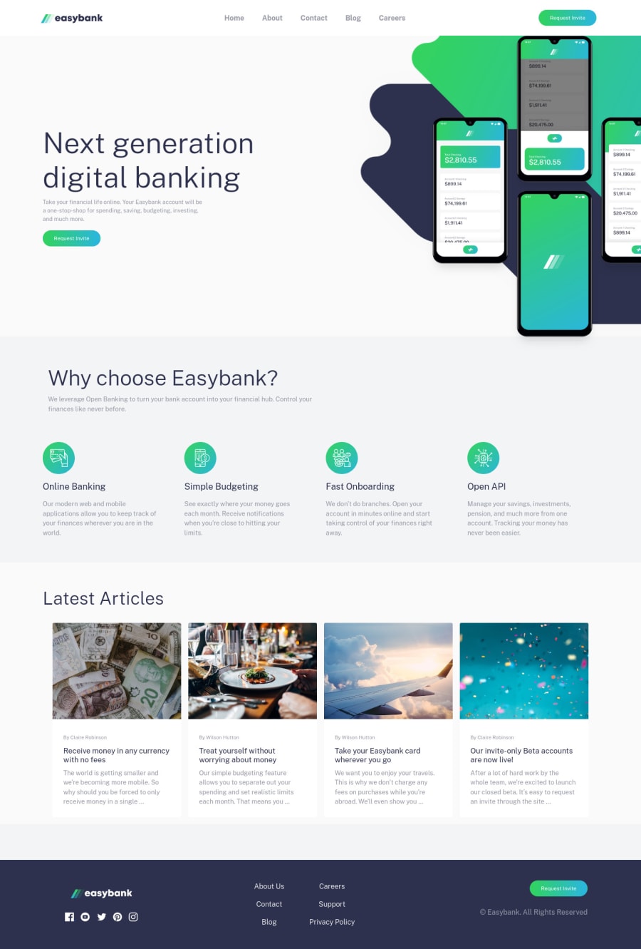
Design comparison
Solution retrospective
I had a lot of issues with the navbar using bootstrap and padding in general. In order to achieve this layout exactly, is it necessary for me to adjust the Bootstrap scss files? I did a little bit, but things started getting messy.
For the mobile navlist, is there a way to make the transition smoother? When it's closed, the navlist jumps back and attaches itself to the navbar. I would like it to just close without attaching.
Community feedback
- @pikapikamartPosted about 3 years ago
Hey, great work on this one. Layout in desktop seems really good, the responsiveness could be better since right now, when resizing, the hero-text gets squeezed, the articles get wrapped and creating large-white-empty-spaces on the sides. The mobile layout however is great.
If you are starting out, I highly recommend not using bootstrap at all especially when some css that you don't know are applied on the bootstrap classes that you use, that will just make you confused. But if you are still going for it, just make a separate class that you apply on the element then just customized that class so that you don't need to touch the bootstrap classes itself.
On the navbar, yeah, it doesn't really look good and there's a bug, the overlay does not remove, it creates different effects on my end and its really weird. Is this bootstrap as well?
Some other suggestions would be:
- First, a typical structure would look like:
<header /> # include the website logo and the nav links <main /> # main content of the webpage <footer /> # footer
- The header on this one is not correct, the
header
should be thedesktop-nav
element. - The
a
tag for the website logo should havearia-label="homepage"
, this way users will know where this link would take them. - The
img
for the website logo should havealt="easybank"
as the attribute, the image itself already has the text. Also, avoid using words that relates to "graphic" like "image, icon, logo" as the value, assistive tech will handle those for you. - request invite I think suits more when it is
a
tag rather thanbutton
. - When using heading tags, if you use
h5
then make sure thath1, h2, h3, h4
appears before it. Do not skip a level, only use heading tag incrementally by 1. - Those articles will be much better if they use
article
element, since those are articles right, and each of them will be a link, a link for users to read more about it. - The
alt
value for the images on the articles doesn't necessary needs to be the actual image itself, for example, "confetti" this doesn't really add anything right, there are more appropriate text that could be used but that is left for you.
FOOTER
- The
a
tag as well theimg
on the website-logo-link should have the same as the ones I mentioned above. - The social media links should be inside
ul
elements since those are list of links. - Each
a
tag for the social media should havehref
pointing to where it leads to, along witharia-label=" {social media name here}"
on it, so that users will know where this link would go. - The
svg
for the social media icons should havearia-hidden="true"
. - The other links should be inside a
nav
element, since those are still your navigational links.
For the mobile dropdown, I don't really want to say right now since it is using bootstrap and what I suggest might just confused you more right now. But I suggest not using bootstrap.
Aside from those, great work
Marked as helpful1 - @dstrickl7Posted about 3 years ago
Thank you so much for your feedback. I am still trying to learn Bootstrap and it's definitely been tougher than just using CSS or SCSS. I will definitely go back and fix some of the bugs and I do plan to keep working on this as I learn more about Bootstrap.
The navbar is indeed Bootstrap. I did my best to use Bootstrap and not default to CSS/SCSS, but I definitely did a couple times when I started getting frustrated with the Bootstrap. I also attempted to edit some of the Bootstrap SCSS files as well but decided not to alter them too much since I didn't fully understand everything.
0
Please log in to post a comment
Log in with GitHubJoin our Discord community
Join thousands of Frontend Mentor community members taking the challenges, sharing resources, helping each other, and chatting about all things front-end!
Join our Discord