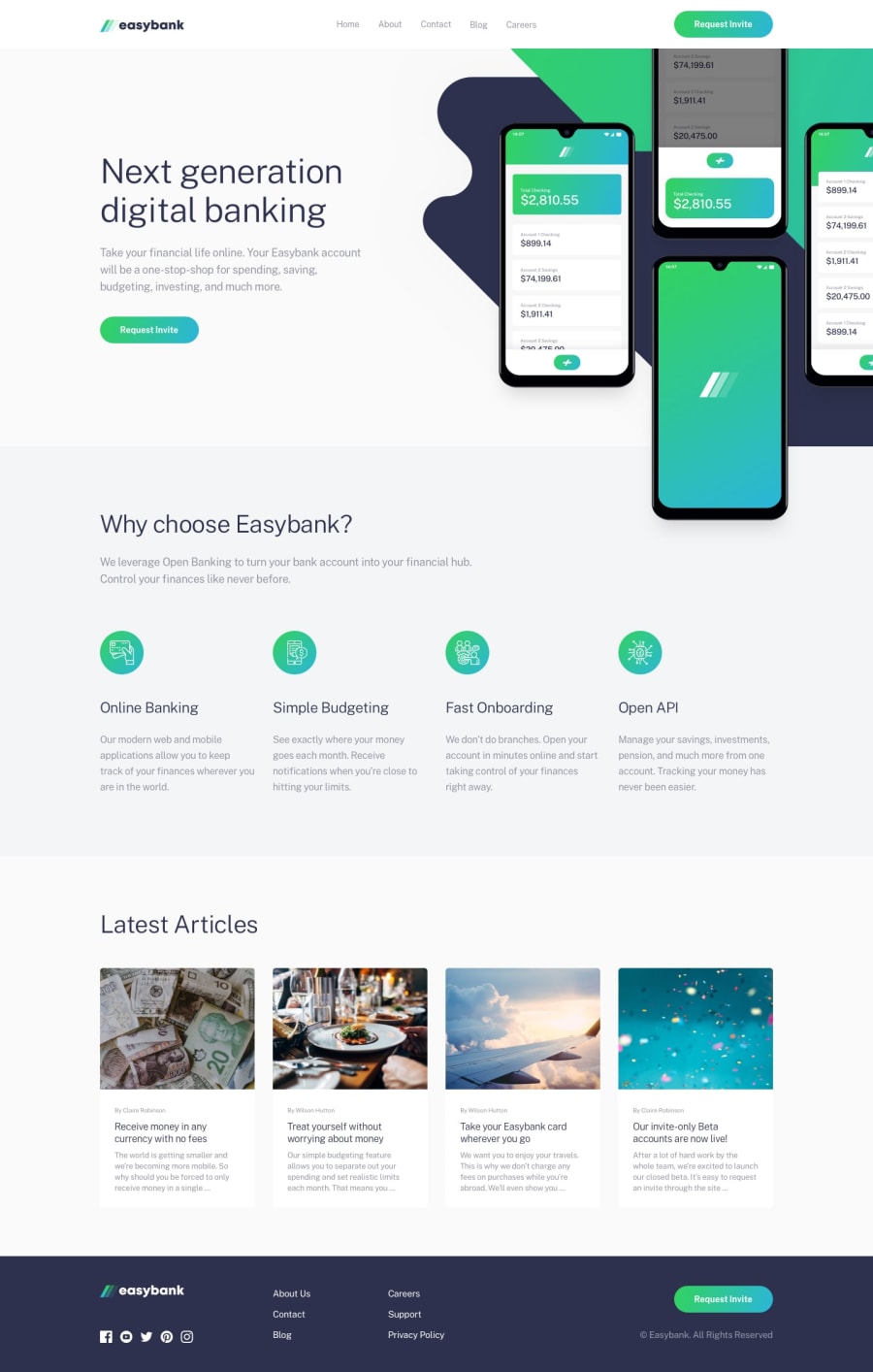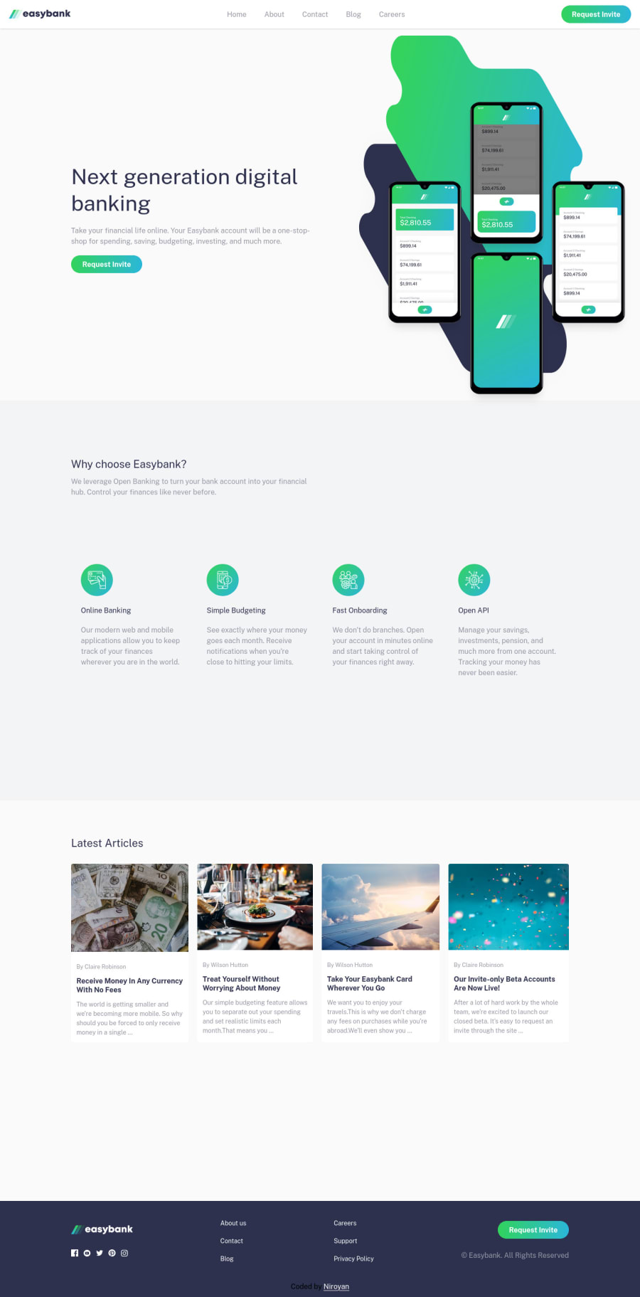
Design comparison
Solution retrospective
✔ React (Components, useState & more) ✔ Tailwind CSS ✔ JavaScript ✔ CSS ✔ HTML ✳ Loading Animation effects - visit this page and refresh it so you can feel like It 🧡.
Community feedback
- @catherineisonlinePosted almost 2 years ago
Hello 🙌🏻 Your solution looks great however here are a couple of things you can improve which I hope will be helpful! 😎
In the footer, you use <img> inside of divs for social media icons. Instead, you need to use <a> tags because it's an external link to the social media platform, it's not just an image. You can also add to this a tag an attribute target="_blank" so it opens in a new tab rather than leaving the website.
Also, make sure to wrap the entire code in the main tag instead of using the div, the one where the class is “root”. It will help to remove report issues and improve accessibility as well. If you are using, for example, header or footer tags, you can place them outside the main tag.
Lastly, the request invite button in the navigation looks really bad at around 579px and less. Might want to fix it, seems like it doesn't fit inside the header anymore.
0@yanniro2Posted almost 2 years ago@catherineisonline Thank you for you such a great feedback
0@catherineisonlinePosted almost 2 years ago@yanniro2 Glad if it helps :))
0
Please log in to post a comment
Log in with GitHubJoin our Discord community
Join thousands of Frontend Mentor community members taking the challenges, sharing resources, helping each other, and chatting about all things front-end!
Join our Discord

