Submitted almost 2 years ago
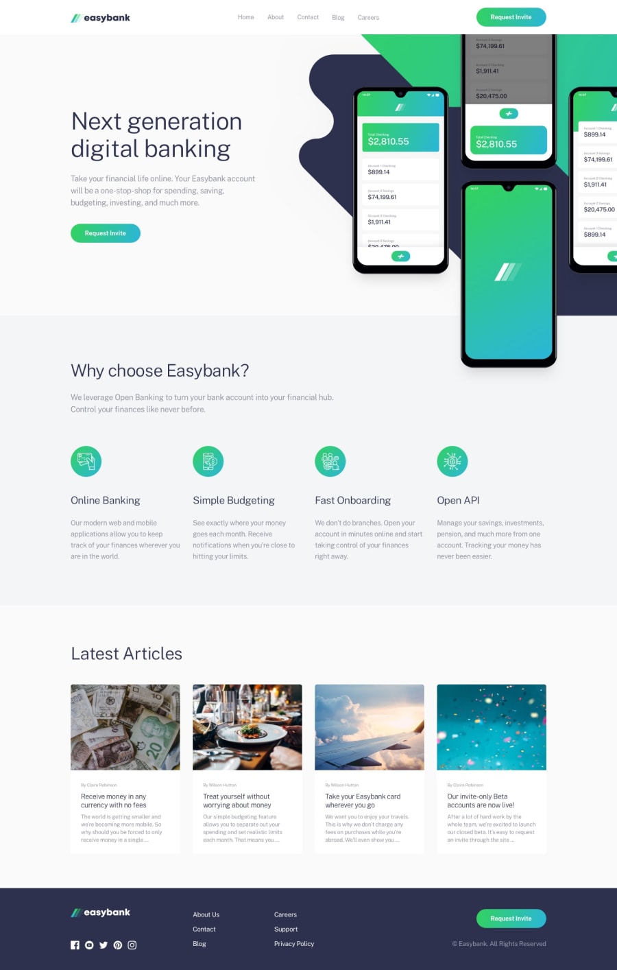
Easybank landing page using vanilla CSS and Javascript
@juandadev
Design comparison
SolutionDesign
Solution retrospective
Well this is my first try in this page, I'd like to read your feedback.
Community feedback
- @adarshcodesPosted over 4 years ago
Hi! @Juandamartn, Great work on this challenge👍 let's see your solution from different aspects:
- Design aspect: Your design looks fine, typography, the layout is quite spot on. One thing you can see is there is a white gap on the right side that is due to the image overflow from its container. To fix it just add
overflow: hidden;to.main__overview__background. - Responsive aspect: your responsive code seems broken, please take a look at your responsive code.
- Issues aroused: try to fix the HTML issues. Happy Coding🙂
2@juandadevPosted over 4 years ago@adarshcodes Thank you so much! I'm going to work on those issues.
0 - Design aspect: Your design looks fine, typography, the layout is quite spot on. One thing you can see is there is a white gap on the right side that is due to the image overflow from its container. To fix it just add
Please log in to post a comment
Log in with GitHubJoin our Discord community
Join thousands of Frontend Mentor community members taking the challenges, sharing resources, helping each other, and chatting about all things front-end!
Join our Discord
