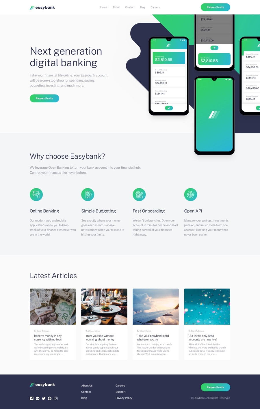
Design comparison
SolutionDesign
Solution retrospective
I still don't know how to fix the background and the image in the hero section. I can't put it in the correct position like in the mock-up. Could you tell me how?
Community feedback
- @AjeaSmithPosted over 4 years ago
Hi Migo, great work on this! If it's a background image you could try setting the
background-positionproperty, maybe something likebackground-position: top right. Let me know if that helps.1@ngoc199Posted over 4 years agoThanks for your help. I have tried
background-positionproperty, but it does still not look like the mockup. So I tried it with the fixed value likepx, and get a good result. With that, responsive is a new problem :(0
Please log in to post a comment
Log in with GitHubJoin our Discord community
Join thousands of Frontend Mentor community members taking the challenges, sharing resources, helping each other, and chatting about all things front-end!
Join our Discord
