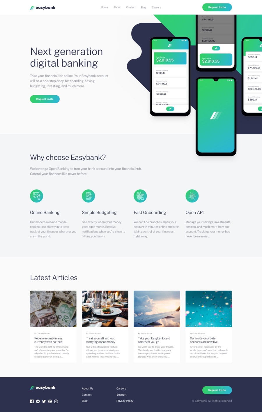
Design comparison
Solution retrospective
Well this is my first design using sass, I had some issues and I would like you guys to give me feedback on how fix them. 1- I struggled with z-index in home section with the mockup img 2- I struggled to add the background image in sass so I had to do it with pure css
thanks to everyone.
Community feedback
- @pierre-pellegrinoPosted over 3 years ago
Hey, it looks nice, great job 😊
I just finished mine and struggled on the same thing, in fact it is pretty easy to fix :
Give your header a high z-index and a position :
header {
position: relative;
z-index: 10
Give your img a positive z-index below 10, and remove
overflow: hiddenfrom your#homesection.I tried on your project, it works like a charm.
Keep it up ! 👌
Marked as helpful0@yasserbaraghPosted over 3 years ago@PierreWagon
Thank you, your feedback was really helpful to me resolving my problem
you can check the new design if you want 😊
1@pierre-pellegrinoPosted over 3 years ago@yasserbaragh Glad it helped !
It looks great ! Now what I would do is maybe making
url(../images/bg-intro-desktop.svg) no-repeatabackground-imageof your main container#homeso it does not overflow with the lower div ! 😊1
Please log in to post a comment
Log in with GitHubJoin our Discord community
Join thousands of Frontend Mentor community members taking the challenges, sharing resources, helping each other, and chatting about all things front-end!
Join our Discord
